
OddGoods is the brand of an independent artist, designer, and puzzle maker.
Reality check: There are a million other creatives, both professionals and hobbyists, who create and sell products based on their artwork on and offline. Online marketplaces such as Etsy make it incredibly easy to open a “storefront” and now that social media platforms allow potential customers to make a purchase without leaving their social media feed, web sites aren’t absolutely necessary any longer. There is so much available at our finger tips, getting noticed becomes the number one hurdle every small creative business faces. This is the challenge OddGoods faces in a flooded market with infinitely subjective tastes.
Brand Development
OddGoods brand name needed to be personal AND personable, with an element of fun, but also have the ability to morph into whatever I needed as the winds of change dictated. I’ve always placed flexibility at the top of my list for every identity I’ve ever been hired to create. Furthermore, brand guidelines are just that, guidelines. An identity system that doesn’t allow any flexibility in how it is implemented essentially places a designer in a box with barred windows. In my opinion, that’s not good design, nor is it solid brand strategy, it’s a lack of vision.
After months of trying to come up with clever brand names, the obvious answer was the one staring me in the face. My studio is called “OddBurton”. I draw a quarter of my heritage from my grandmother who was Norwegian. In old Norse, the word “odd” means a “sharp point”. It’s safe to assume that my ancestors were not referring to the sharp “point” at the end of a pencil, but a single dot from a sharpened pencil is a pixel and I’m known for my attention to detail.
Odd refers to my illustration tool of choice but it also conjures the notion of being strange, unusual, and unique, all characteristics intrinsic to my art style and personality. Rather than follow through with creating a new name for my brand that may or may not have any connection with my illustration and design studio, I scrapped all my notes and chose the simplest solution—Drop “Burton” and add the word “Goods” … Bingo, bango, I create odd products. “Goods” is the perfect fit for any and all products I could ever wish to create.
Ultimately, “OddGoods” provides my brand with the flexibility in name, purpose, and creative expression I want all wrapped up in a cool-ish sounding name that creates a direct bridge between my studio (umbrella company) and my online storefront.
Brand Strategy
OddGoods strives to create high quality products and provide a level of personable service to my customers second to none. Sounds familiar right? That’s because it is the most common marketing approach across the retail landscape. It’s so common that it’s essentially meaningless as a marketing approach. So how do you distinguish yourself if everyone else says exactly the same thing? Well, details matter.
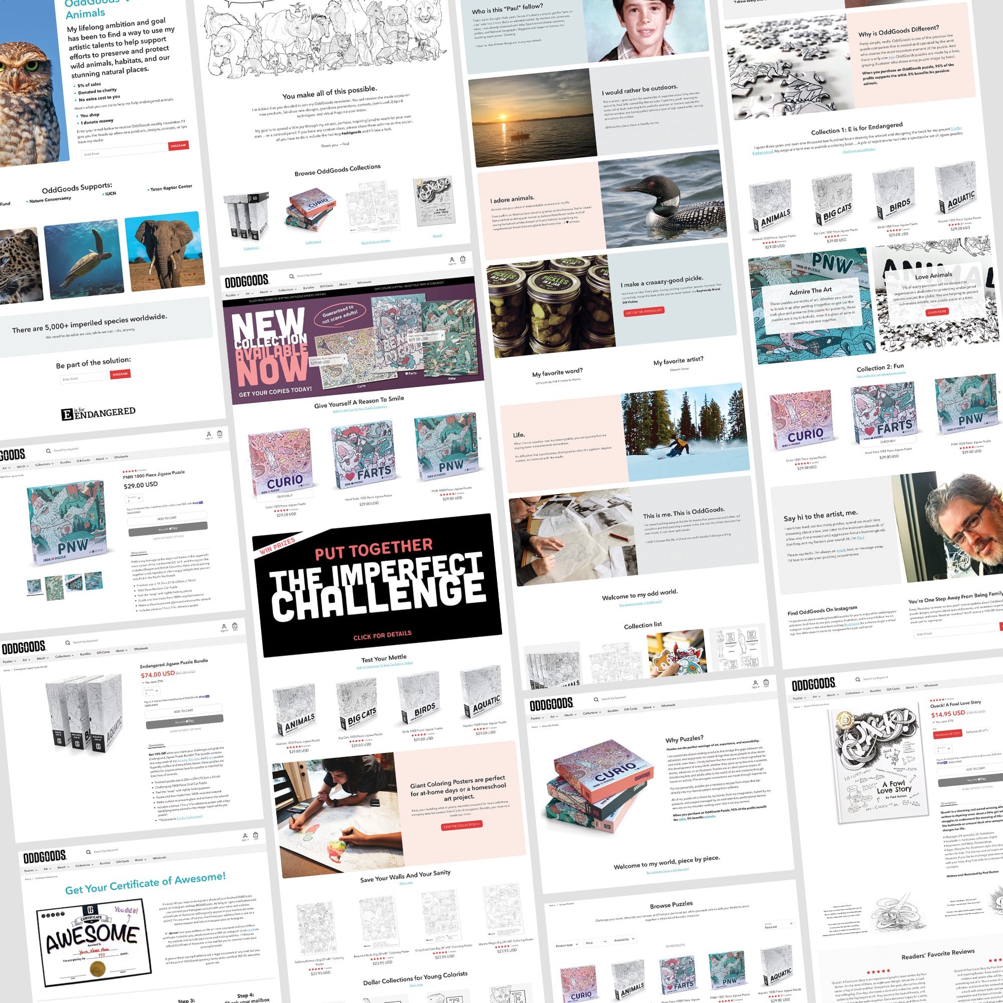
Within the puzzle community, nearly every boutique puzzle maker does their best to stake their claim in a particular niche that will set them apart from competitors. Whatever their particular niche, the most common marketing angle is almost without exception tied back to some variation of “we support artists”. This phrase is ubiquitous. Meaning, the vast majority of puzzle companies are merely distributors who manufacture puzzles using art created by independent artists. There are precious few puzzle companies owned and operated by the artists themselves and there are even fewer that only sell their own work—I’m one of those few puzzle companies.
OddGoods is an artist-owned business that creates high-quality puzzles with my own 100% unique art. I’m not peddling products I didn’t create from the ground up, it’s all me, every last line and pixel.
My brand story is one of absolute authenticity to my art, my passions, and my vision—This is what differentiates me from every other small puzzle company. My art is personal. My puzzles are personal. OddGoods is literally, me. My art can sometimes be odd and that's good.
Logo
I wanted to create a mark that embodied a strong, steady, and professional visual representation for my brand, something that gave me the flexibility to adapt it when needed and was easily readable at small scale in the mobile environment.
What do I mean when I say that a logo needs to be “flexible”? Every logo should be able to hold its own in black and white. In my opinion, if color is required for a logo design to “work”, it’s not a successful mark. This approach comes from my days designing newspaper print ads—they were black ink on newsprint and a logo had to be readable when placed in a classifieds ad that was 1.5 inches wide. Yup, this dates me, but it’s still a thousand percent relevant in a digital world.
OddGoods base logo is black on white or white on black. This allows me to explore any color combination I want moving forward. Color is an accent and should be treated as a means to personalize your logo marks and brand identity for marketing initiatives as you see fit. Brand guidelines that adhere to rigid color palettes can be helpful but they also lock designers into design solutions that become repeatable, which leads to templates, which leads to stagnation. Color is a superficial means of creating a visual identity.
The single most important criteria for my identity was that I did not want my logo to draw energy away from or clash with my products and packaging. My products are the heroes, my logo is simply a means to identify who created them. Hence, a simple, straightforward, easily adaptable logo mark was the answer.
Which leads me to flexibility, I adapted my base logo with a simple visual device to help people recognize that puzzles are OddGoods primary product. The logo hasn’t changed, it has simply been enhanced to accommodate my primary product offering for specific marketing channels. With one tweak, it can tell a customer that my products are puzzles without a descriptor. But if I want to sell a new book, I can simply revert back to the base logo mark without the puzzle notches.
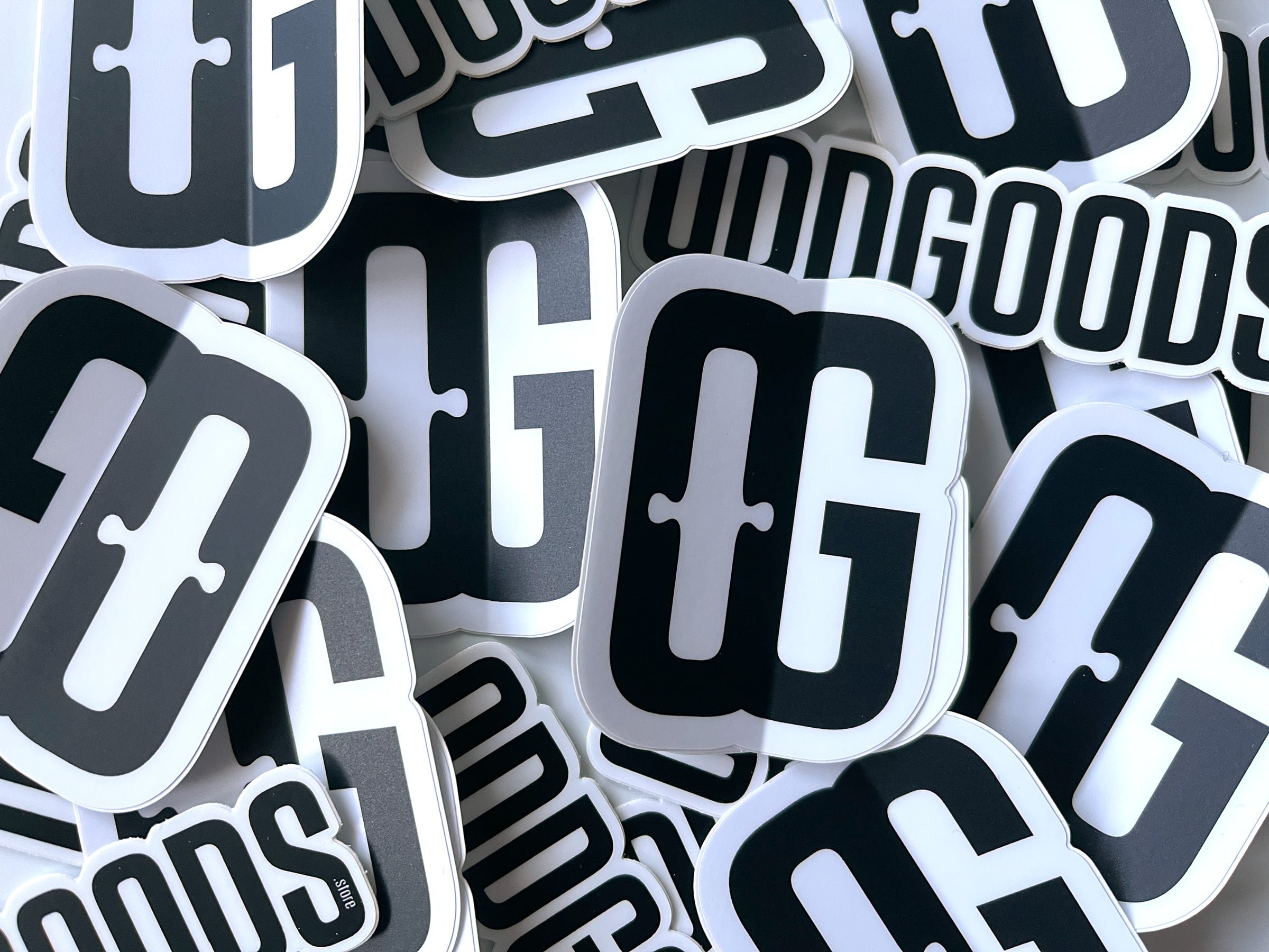
Icon
The official logo does not include an icon. I developed a secondary mark for use in situations where a horizontal logo doesn’t work as well but it can also be used as a standalone graphic. My OG icon also gives me some fun room to play with meaning—OG stands for "OddGoods", but can mean "Original [puzzle] Gangster" or "Old Guy."
Visual Language
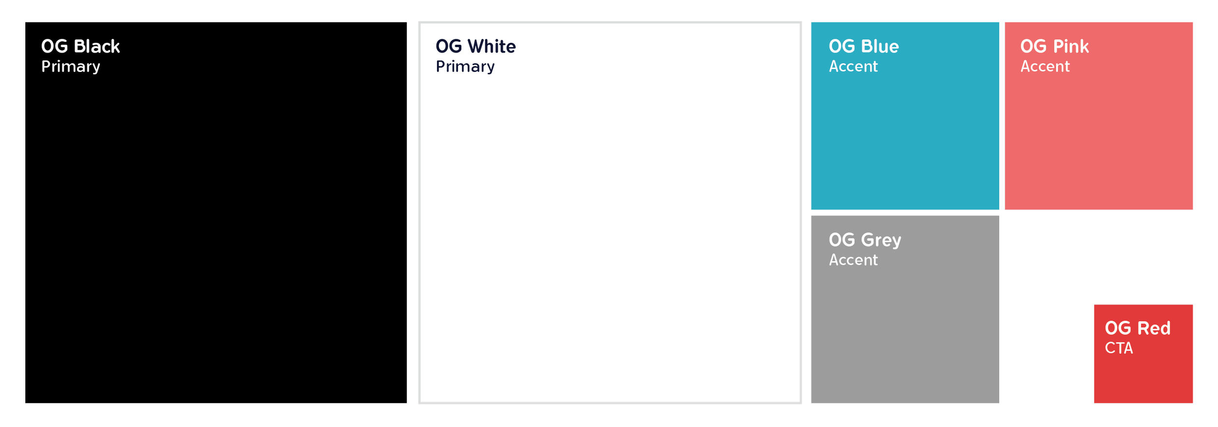
OddGoods overall color scheme is black and white with a few accent colors—blue, pink, and grey—used sparingly to call attention to key elements like subheadings, prices, and text links. Red is reserved exclusively for CTA's and pricing on the website and the occasional highlight in a social media post. The sole purpose of the limited color palette is to prevent any aspect of the brand colors from overshadowing the artwork showcased in all of OddGoods products but provide a visual queue for design elements I want customers to see.
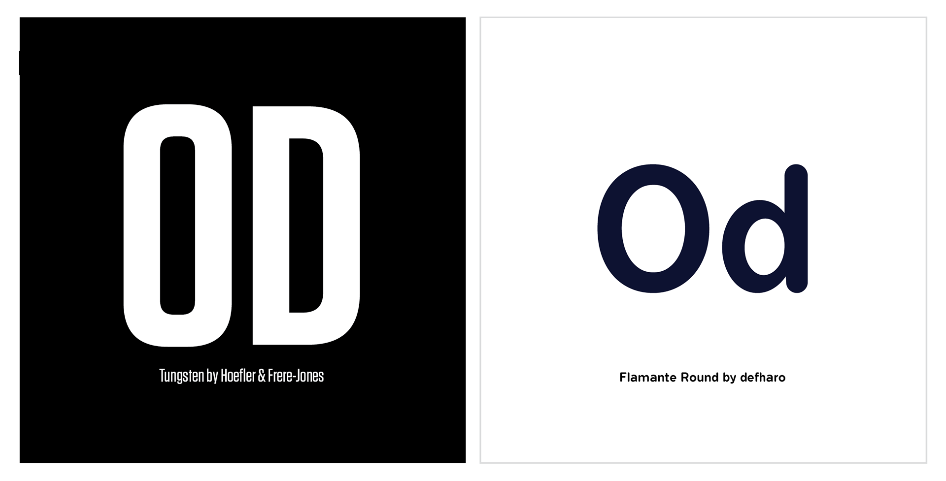
OddGoods primary typeface is Tungsten and is used exclusively for the logo and icon. I selected a bold sans letterform that is modern, condensed, and chunky enough to “play with” without losing its visual integrity. The primary display and print font I'm using to compliment the hard edges of the logo is Flamante Round which has a similar thicker feel with softer edges that make it eminently easy to read and adds a touch of fun to the brand.
Brand Support
Quality, Creative, Educational, Fun: These are the four pillars of OddGoods brand identity.

Quality is a very subjective term. It is most frequently used to describe the materials used to create a product but that’s too narrow of a focus (and frequently not true). “Quality” can also be established by the brand identity package and that includes everything from the marketing materials to POS displays to packaging to business cards to customer service. I’ve done everything I can to create an overall sense of consistency in every aspect of OddGoods outward persona and that consistency helps establish "quality" as a legitimate core characteristic of my brand.
The operating belief is that if I care enough about my business to sweat the details, you can better believe that attitude translates into my products and service too. The future of my brand will hinge on how well I manifest these core principles into growth opportunities. The marketing materials I’ve chosen to have produced encompass the most common points where my brand identity intersects with the customer experience—Nothing is missing and nothing is superfluous. Including some repurposed swag from a previous venture.


OddGoods Certificate of Awesome and the Puzzle Wiz gold seal are snail-mailed to customers after they complete an OddGoods Puzzle and post a photo on Instagram. This one-of-a-kind "extra" keeps customers engaged after they've interacted with an OddGoods puzzle—no other puzzle company on the planet does this.


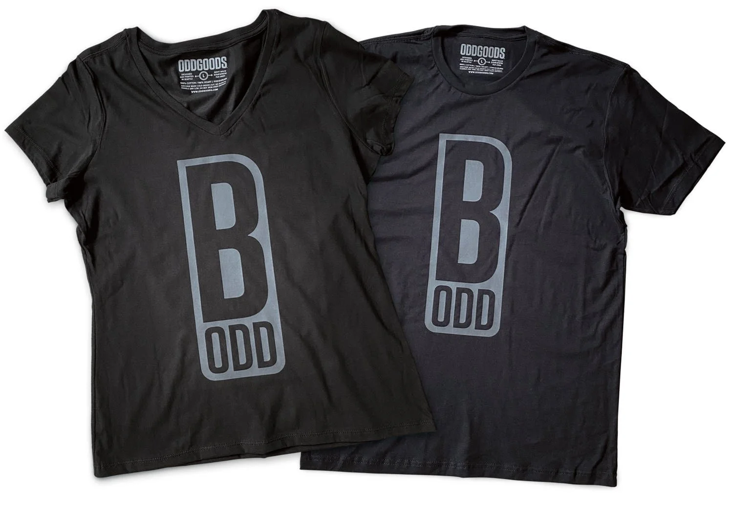

What do you do with leftover inventory from a previous project? Reuse it, if you can. I removed the old logo patch from this beanie, designed a new one using OddGoods catch phrase "be odd", then had the updated patch sewn onto the beanie. A cheap and effective means of revitalizing inventory that would otherwise be gathering dust.
Voice
I have two goals with OddGoods: to educate without preaching and to give people a reason to smile. I want my customers to love what I do because it makes them feel good. My voice across all my media channels is irreverent, silly, stupid, sometimes educational, occasionally serious, but always 100% authentic and rarely includes a hard sell.
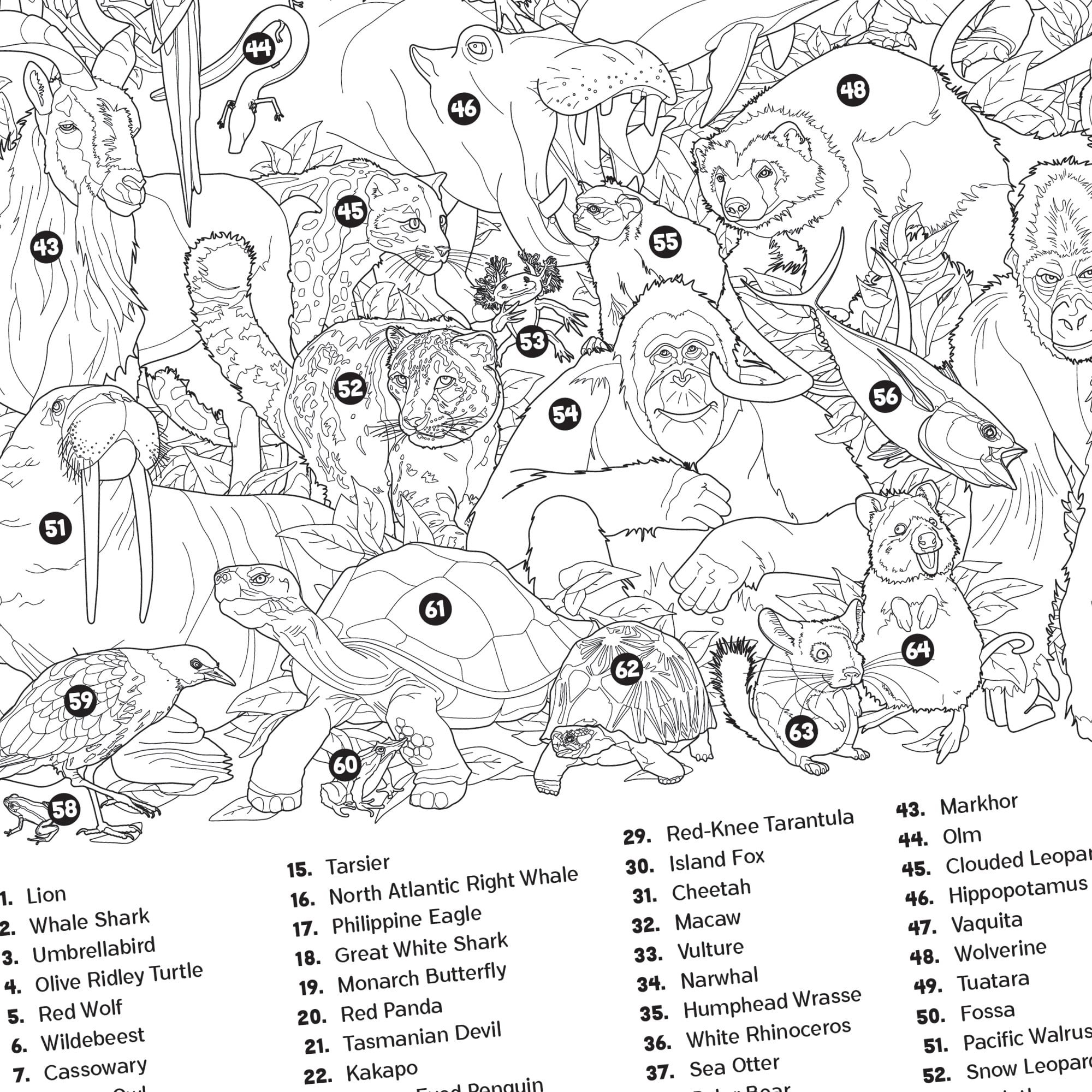
A part of my voice and my mission is to raise awareness for and raise money to support endangered animals around the word. OddGoods 'animals' puzzle series represent the first stage of ongoing product development geared to help this initiative.

OddGoods.store
OddGoods is built on Shopify and I spent months tweaking CSS, templates, building new templates and pages, and customizing every point of contact customers have with the site down to the automated emails.
OddGoods eCommerce site is designed to help people find what they are looking for quickly but if they stop to look around, what they will find is a deep, highly polished, professional online storefront that exudes quality and personality. Products all have clear and concise descriptions and are available for quick purchasing. Content is purpose-driven and designed to give my customers insight into the artist behind the work and all assets have been optimized for SEO in an effort to offset the inherent tradeoffs with using a web-based eCommerce site builder.
Point-of-Sale
In 2022, OddGoods will be focusing on organic growth with in-person sales to help introduce my local community to my puzzle products. Again, every single aspect of my market storefront has been considered down to the shelving I designed and built to make transport and assembly easy.
Seattle is known for its year-round outdoor markets and I found after attending numerous neighborhood markets that there were a number of simple things I could do to set OddGoods apart. I had a custom branded tent made that stands out like a sore thumb from a distance—It looks highly professional and speaks to the quality of my brand. Next, I designed my display to draw people in so that I can engage with them one-on-one. I’m not just selling puzzles, I’m selling the artist, me. It also forces a reluctant salesperson (me) to engage with customers and improve his sales pitch. Finally, my display layout created a space that offers people shelter on a rainy day.

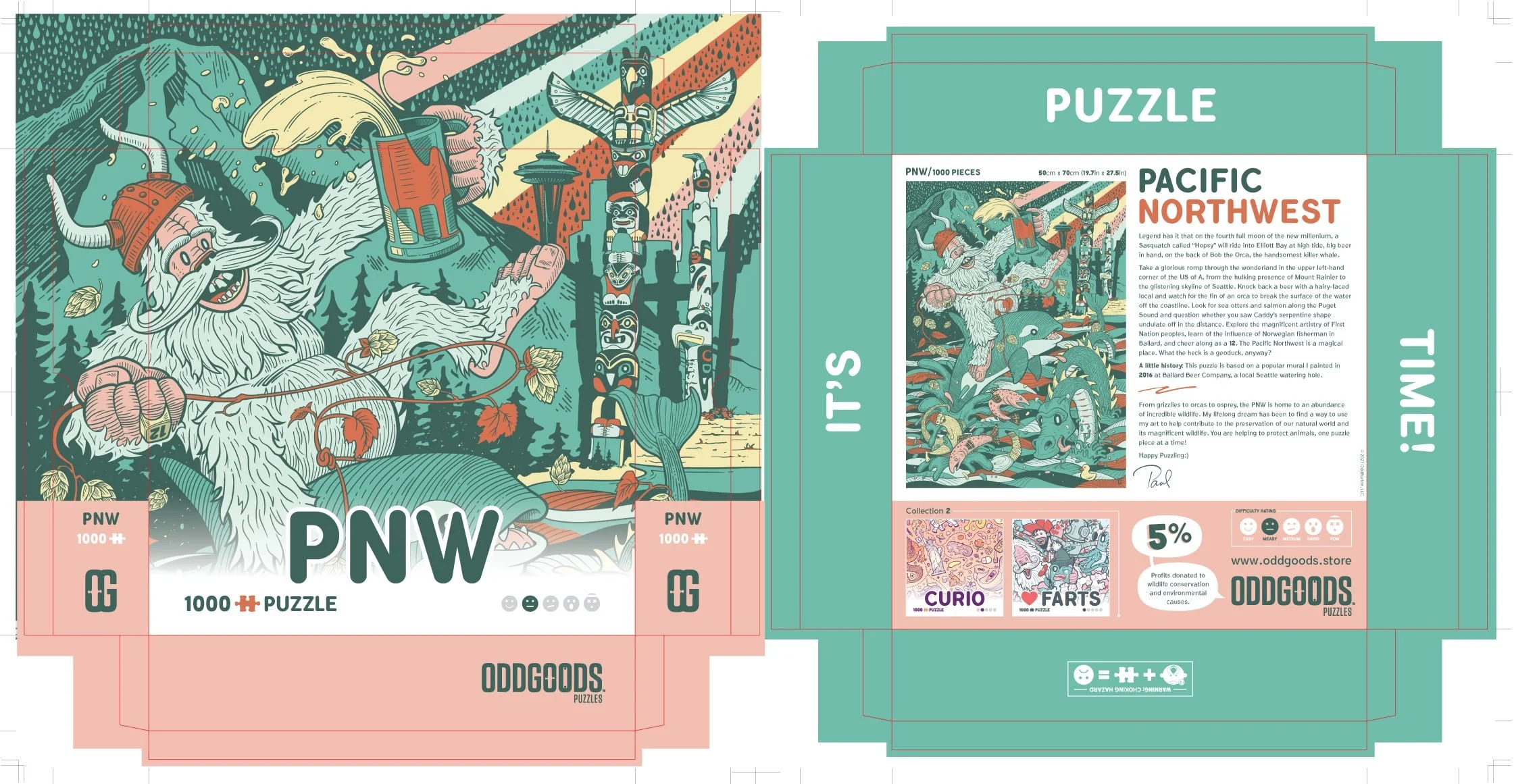
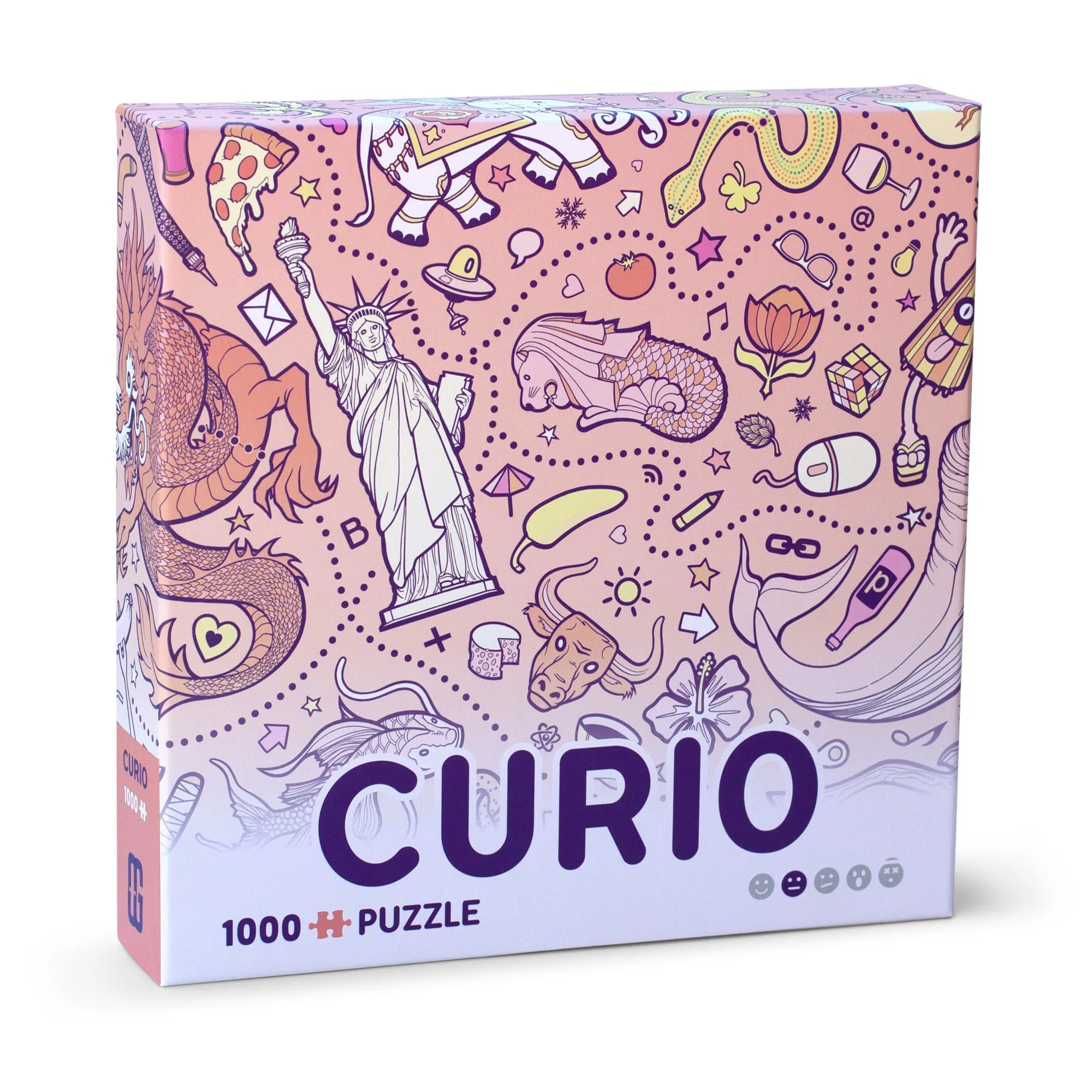
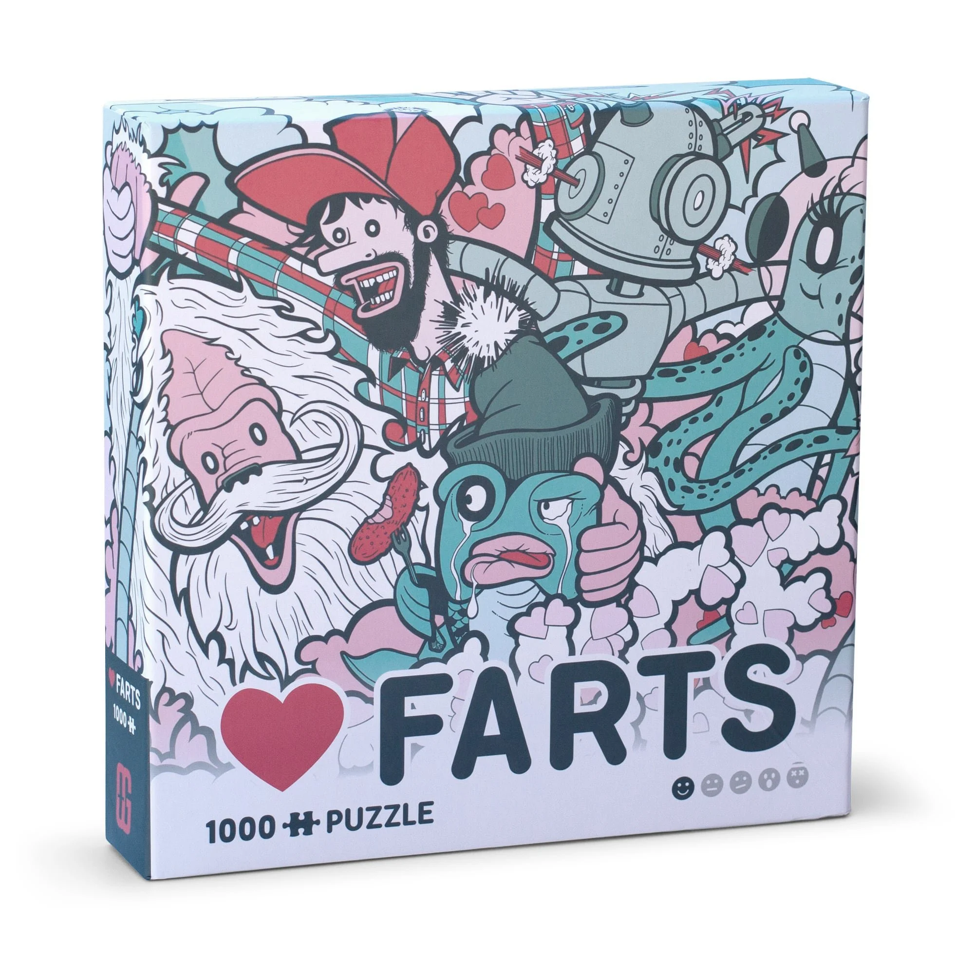
Packaging
OddGoods packaging rounds out the overall aesthetic of the brand with fun, engaging designs that feature the artwork as hero.


Developing a brand isn’t a one-and-done objective, a brand is a living, breathing entity. As long as it is built on a solid foundation, you can adapt to new ideas and new approaches with relative ease … Exactly what a successful brand identity needs to be: flexible enough to manage inevitable change.
