Driven to Wonder is an RVing book that tries to answer the "why" rather than the "how" of the RV lifestyle.
Mike Boyink contacted me to illustrate and design a front cover, back cover, and spine for a book he was planning to publish through Amazon KDP entitled Driven to Wonder. The book is a collection of stories that describe his experience living the RV life with his family of four for eight years combined with valuable tips and tricks describing how they managed to make it work.
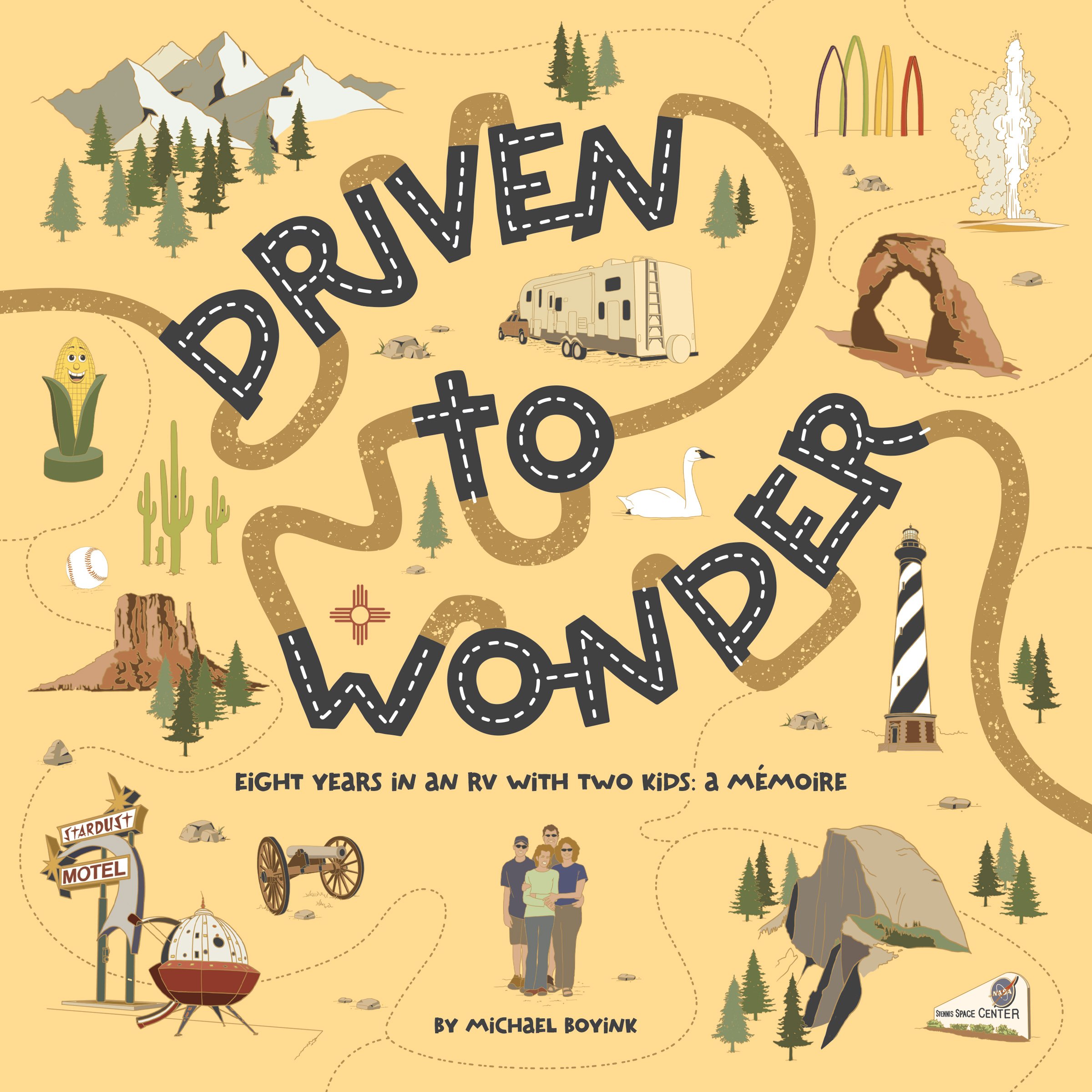
The initial project description included a brief summary of the elements he wanted to include in the artwork along with samples of book cover art that caught his eye. The book dimensions would be 8.5" x 8.5" and the spine width would need to be flexible to accommodate a page count that wouldn't be solidified until the writing was completed. The three required elements were: A representation of a truck/fifth wheel RV, a family of four, and something to "wonder" at.
I had some initial ideas how to tackle the artwork, but I set about researching book cover art in the travel and RVing markets just to familiarize myself with what was already out there. What I found was entirely unsurprising: There were essentially three typical visual approaches designers took to represent "travel" on book covers: 1) A road winding off into the distance, 2) a flat landscape that "stepped" back from the foreground to the background with a "destination" of some kind in the background highlighted by a sun, and 3) a city or numerous famous landmarks rendered in a graphic style on a horizontal plane or wrapped around a circle representing the Earth.
There's a reason why illustrators and designers tend to default to standardized imagery: It works. Consumers tend to shop visually, scanning book shelves or web pages for imagery that matches their expectations. My challenge was in creating a solution that toed that line but was also unique enough to stand apart from other books on a display (on or offline).
Concept Sketches

Concept Development & Execution
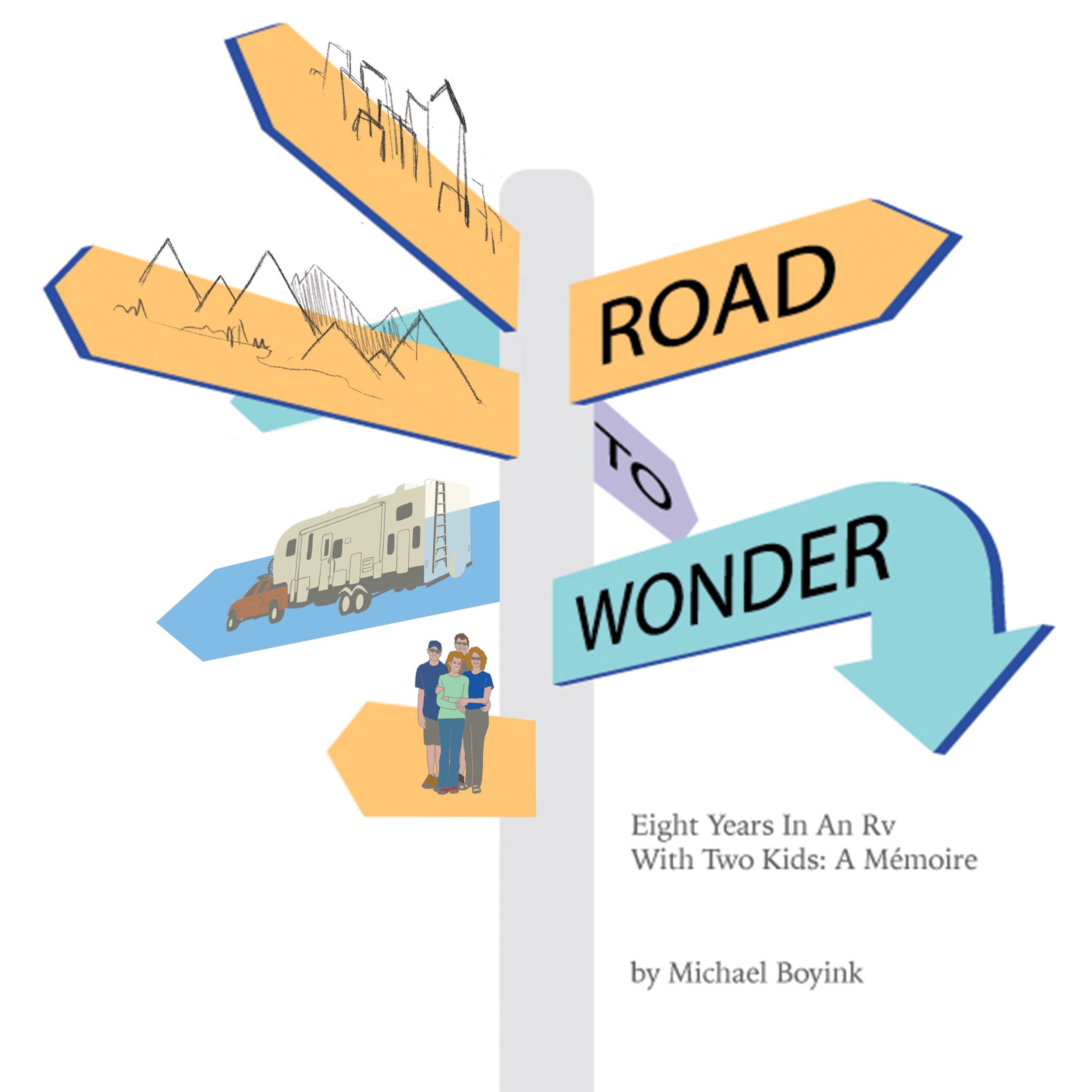
I narrowed the concept sketches above down to two samples that I thought had the most promise—a way finder sign and roadways. Of the two, Mike and his wife decided to move ahead with the second design. I agreed this was the stronger solution.
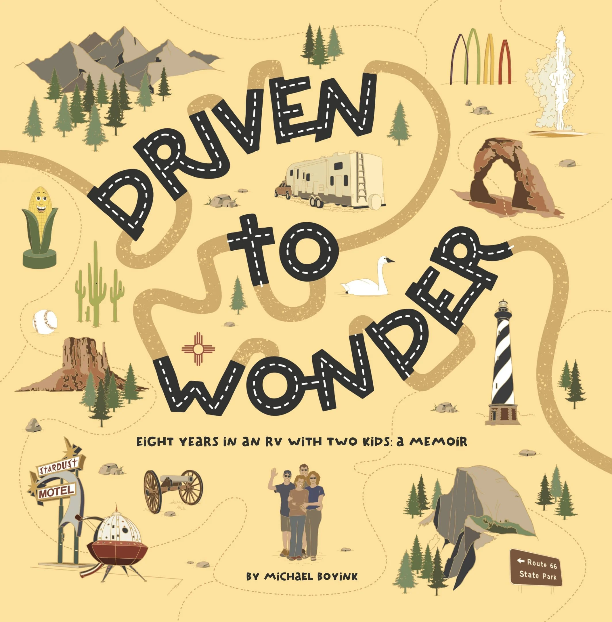
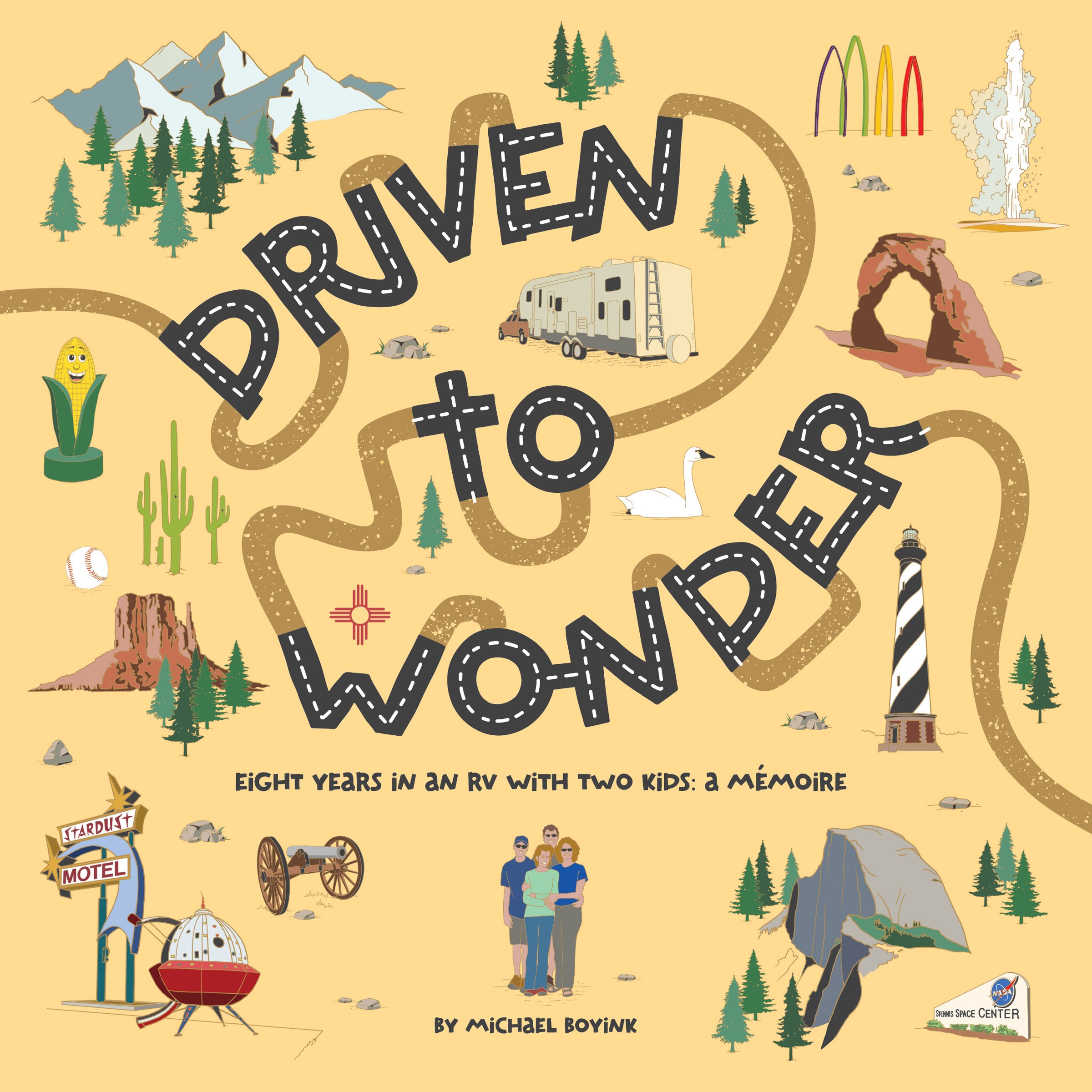
My idea was straightforward—I wanted the title of the book to look like roadways and various destinations would highlight the idea of "wonder". This approach would make it a simple matter to include the required elements and provide me with plenty of room to play.

To help tie the cover vignettes to the content, rather than simply illustrating random points of "wonder", I illustrated well known landmarks or imagery for locations the family visited on their adventures noted in the table of contents. Turned out that I've been to many of these places, so I was able to use my own photography for reference.

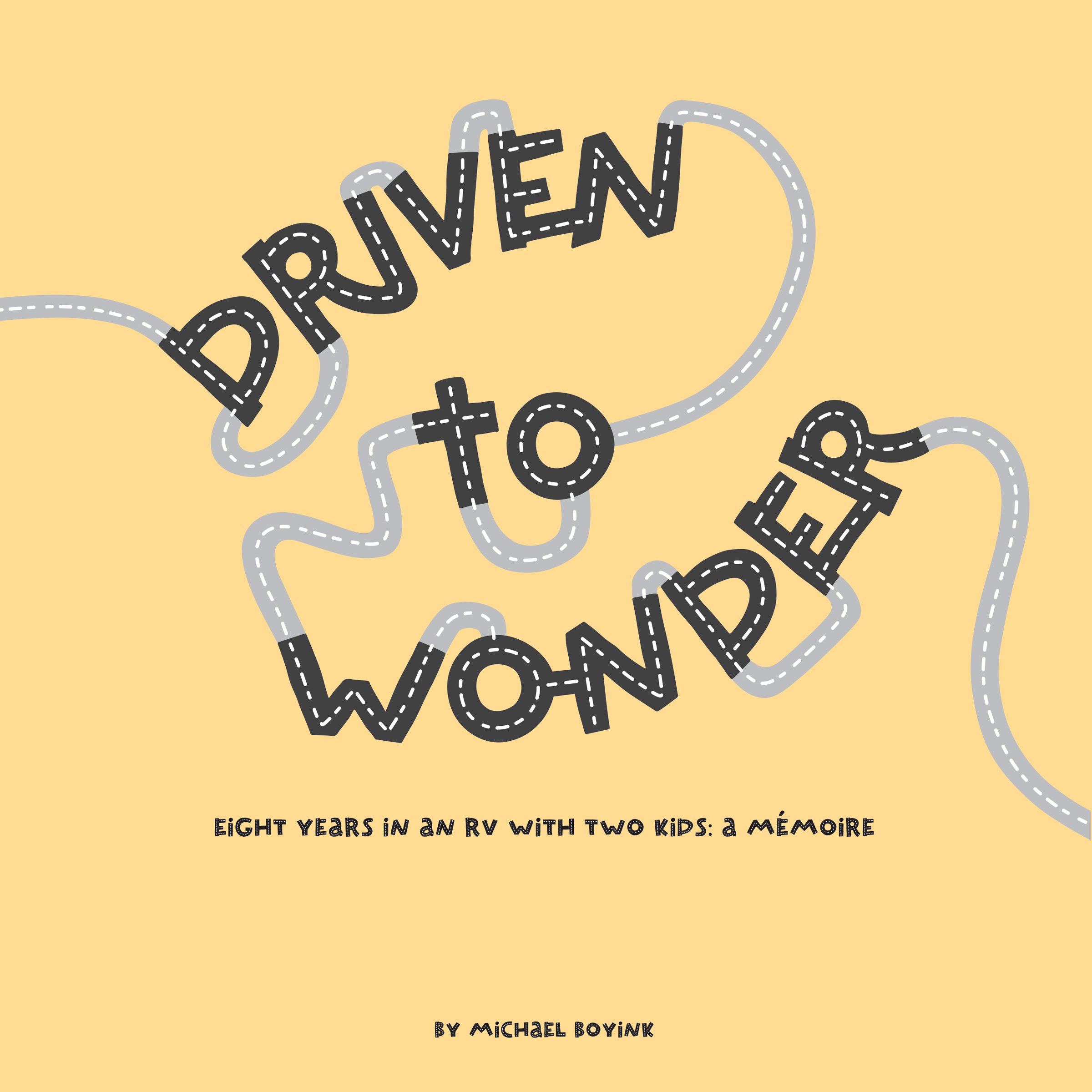
The initial idea was to illustrate the title of the book to represent a road. My thoughts were that the black lettering with hash marks suggested highway travel and the grey road suggested secondary roads. To help the title text stand out more, I converted the grey to brown, deleted the hash marks and added a texture to represent dirt roads. Conceptually, this worked very well because their adventures included travel on all types of roads.
After illustrating the vignettes, I needed a visual device to help tie all of the elements together. This book is about adventure and many of the sights described require a hike to see. I added dashed lines connecting the vignettes to represent "hiking trails"—which has the added effect of drawing the readers' eyes around the illustration ... Creating a visual adventure.
Finally, while it looks like there is a broad range of color in the illustration, the palette is limited. The fourth sample shows a filter placed over the entire cover to blend the overall color palette.

Amazon KDP has some very specific requirements for publishing on their platform, therefore it is paramount that their template be followed precisely. I created an overlay file that allowed me to import the template into my art file and tweak the art to my liking...which probably took more time than the artwork itself due to my tendency to be finicky.

The spine was the final element in the design that I tackled. I wanted the design to flow from the front of the book to the back and initially designed the art so that a road and hiking trail crossed the spine. Because the width of the spine was in flux, I wound up blocking in the spine with black and passed the road "under" the spine to accommodate the inevitable changes. I also converted the text to white to help it pop on a sales shelf.


The final design and artwork is fun, engaging, and unique and effectively creates a strong visual analogy of their adventures while including all of the required elements.