
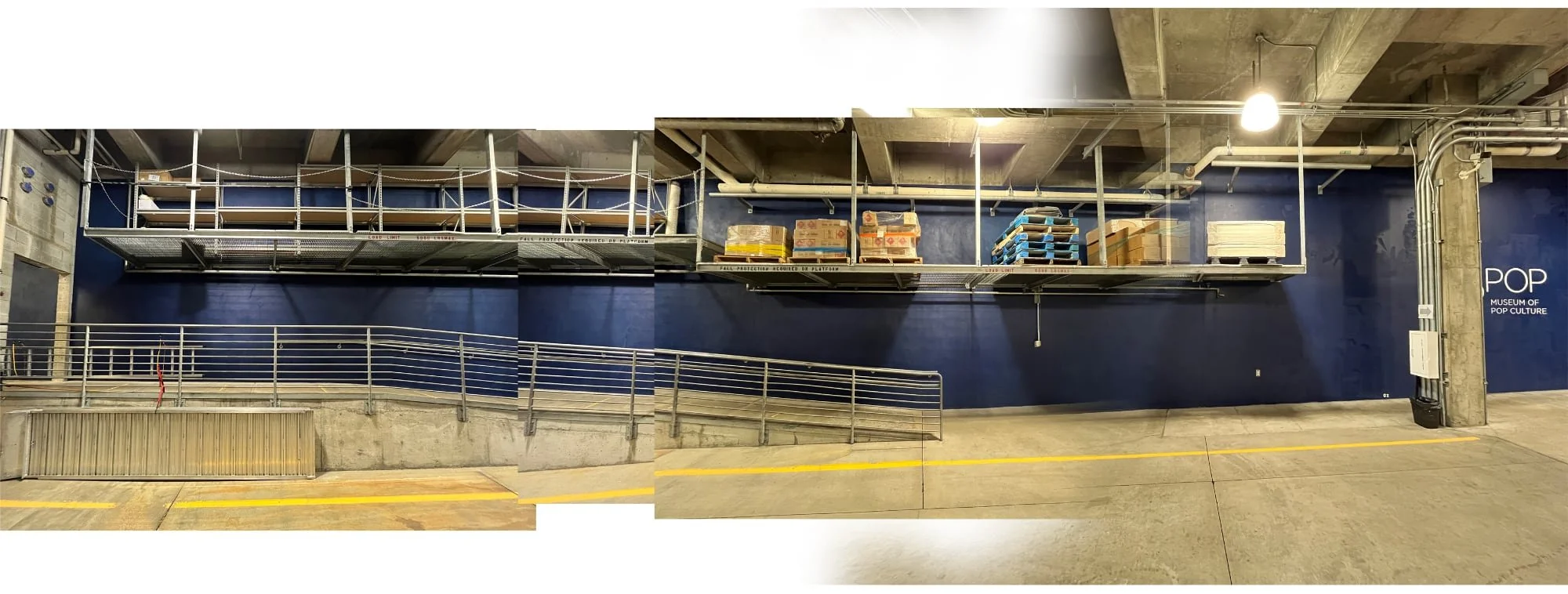
In July of 2022, I was approached by the Director of Museum Operations at one of my favorite places in all of Seattle, the Museum of Pop Culture, better known as MoPop, and asked if I would be interested in painting a mural for a potential project. They wanted to have an image created for museum staff that would help boost moral, inspire creativity, and describe the mission of the museum and were looking for a local artist to help make it happen. The conceptual challenge for the artist was to visually interpret and represent MoPop’s core value statements, which included a number of amorphous ideas that wouldn’t be easy to represent pictorially. I had an opportunity to view the location after our initial discussion and the wall they had in mind was an oddly shaped monster in the garage. The wall measured 80 feet long and averaged 6 feet tall and had already been painted with a deep, dark blue hue. It stretched from the employee access door all the way to the security station at the far end of the garage and was shaped like a very shallow “V” with at least half of its length bordered by a railing along a narrow walkway and hemmed in above by an elevated storage shelf. The path from the entrance door lead to the security station and is punctuated at the very end by a poster-sized acrylic display emblazoned with the museum’s primary mission statement—This is what every employee sees every day when they clock in for work. The museum wanted to make this walk a little more interesting for their employees and external vendors.
The mural would not be accessible to the public, only authorized personnel and visiting dignitaries who enter the museum via the staff entrance would ever experience the artwork. One look at the wall and I was in. In fact, my wheels were already turning. I left the museum that afternoon excited for the possibility of working with MoPop on the project, but tempered my enthusiasm because it hadn’t yet been approved and I hadn’t officially been selected for the job.
A couple weeks later, I received an email. Internal momentum was picking up and they wanted me to meet with Michael, Sr. Manager of Facilities Operations, to discuss the project. They were interested in working with me but we had to get a budget approved before anything would move forward. I submitted a proposal and waited. A month and a little negotiation later, my proposal won approval! I signed the contract with a “WHOOP!” the second week of September.
Discussions
Of the five core values that would be represented in the mural, only two of them lent themselves to easy visual solutions. They didn’t have any concrete imagery in mind, only that they were leaning toward a more “iconographic” approach rather than a realistic approach in a effort to show diversity and experience using symbols, not exactly an easy task with values statements that require a measure of creativity for an individual to internalize. Complicating this individual experience with icons and symbols would make the “story” of the museum more difficult to tell because it would be opaque. I wanted to find a way to combine the two visual styles using imagery specific to the museum and the museum’s mission to tell a compelling story.
In most cases, I try to stay away from obvious solutions, but I also don’t shy away from imagery that is commonly used to represent a specific idea—The trick is to do something different. I met with Michael and began discussing ideas. We talked at length about the mission of the museum, their purpose, and what they hoped to achieve. I asked if there were ideas or imagery that they were keen to have me include? There were no requirements, but Michael asked if I could possibly incorporate two things: 1) introduce the idea of old versus new in the sense of technical or technological advancement through time and 2) somehow explain that the museum isn’t simply about ideas, but also the hard work, manual labor, and teamwork that goes into creating the exhibits—Visitors only see the end result of months of effort contributed by dozens of people.
The core values represent the beating heart of the organization, who MoPop is and what their goals are as an arts-centric non-profit. More importantly, they speak to the responsibility each employee accepts to help facilitate the museum’s interactions with the larger community. The objects in the museum are the shiny objects that keep people coming back, but the employees ARE the museum.
The values described the script to the overarching narrative and it was my job to bring the story to life:
The Museum of Pop Culture’s mission is to make creative expression a life-changing force by offering experiences that inspire and connect our communities.
Core Values
• Open arms: We practice radical hospitality and equitable access.
• Creative exchanges: We create space for community voices and collaborations.
• Light bulb moments: We use pop culture as a catalyst for learning, connecting, and creating.
• Pursuing excellence: We believe integrity, innovation, and hard work lead to amazing things.
• Excitement: We value the thrill that comes from experiencing creativity together.
The goal would be to create a concept that stitched together these ideas in a visual narrative that made sense without the aid of explanatory text. The best storytelling establishes a well-defined foundation that allows viewers imaginations to arrive at their own conclusions—Done well, their conclusions will parallel the artist’s original intent.
Preparation
The planning and creative direction and problem solving for large scale public works is every bit as time consuming and important, for example, as a UX project or a brand package. The difference is, once the paint is on the wall, there’s no Command-Z.
I arranged to visit the museum to tour the exhibit halls as a creative archeologist, looking for inspiration amongst their collections. I’d visited many times before, but I wound up taking hundreds of photos of objects, patterns, details, and displays throughout the museum. I wasn’t quite sure how it would all contribute to the concept sketch, but an idea was beginning to take shape that would satisfy every one of the general ideas they wanted me to explore.
I took a series of photos of the wall with my camera held above my head doing my best impression of a steady cam rig walking down the garage. These photos were used to assemble a rough composite of the entire wall and I outlined the available space to create a template for the concept sketch.
Concept
When creating a concept, it’s important to consider the shape of the space (this applies to any design work). This long, very long, horizontal space had a big influence on my direction.
The thematic device I was considering would effectively tie together the entire mural from start to finish but I wasn’t a hundred percent certain I could make it work. I wanted to avoid what I assumed they would be expecting—a solution that involved a handful of independent vignettes joined by irrelevant filler art (like you see in so many public murals). I let my ideas percolate for a week, before I picked up my stylus.
When I finally sat down to sketch, I had the entire image worked out in my head. The pictures just flowed out of my imagination.
A little history: Paul Allen opened the Experience Music Project (EMP) in 2000. It changed its name four more times over the next sixteen years before finally landing on “MoPop”. Originally, the mission of the museum was to celebrate music, specifically rock ‘n’ roll (Allen was a musician). It has since become a temple for pop culture, housing Allen’s extensive personal collections of artifacts from sci-fi, fantasy, and horror genres, Nirvana, Pearl Jam, Jimi Hendrix to video gaming, sounds labs, and galleries that display rotating exhibits featuring everything from Hello Kitty to Star Wars and Black Panther costumes.
My concept would pay homage to all of these things, and then some—I included dozens of references to museum exhibits as well as to local and Pacific Northwest culture. As a matter of fact, there are only two random objects in the entire mural (I just wanted to include them). To help the story flow a little more naturally, I reordered the value statements and added a sixth intro section to help establish a foundation for the narrative.
Section 0 — History
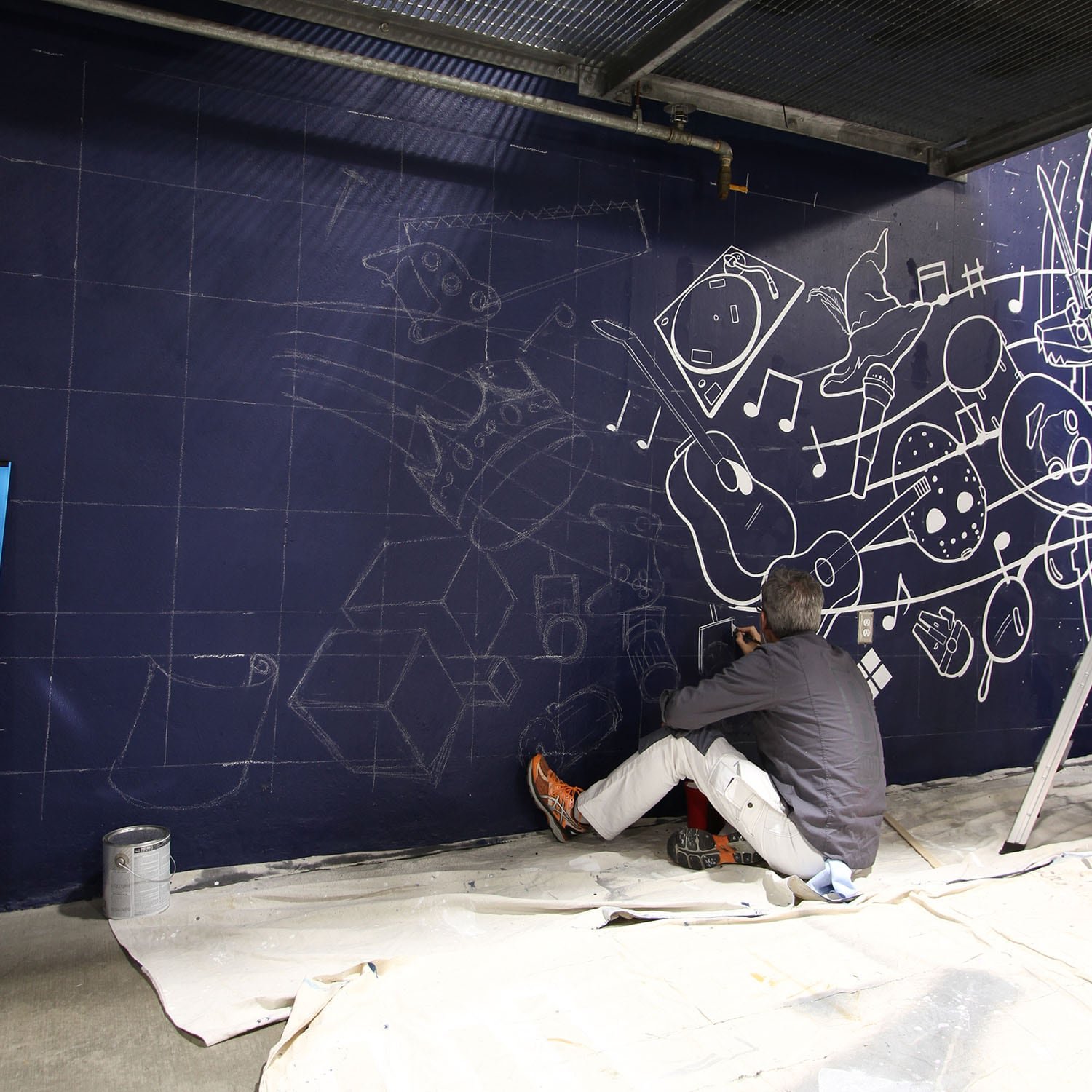
The blue wall hosts a giant interstellar space gate representing the sci-fi collection. Out of this gate flows a wide assortment of the foundational objects that influenced the creation of the marvelous box Frank Gehry designed to house them. These bits and pieces of pop culture include four guitars that represent the world’s first guitar all the way to the modern electric guitar (fulfilling the technical advancement request). These objects flow into …
Value 1 — Pursuing Excellence
Innovation, hard work, and integrity are represented by building materials, a direct reference to the Indie Games exhibit with its iconic cube structures, and a variety of building materials, tools, and a blueprint. Staff lines carry objects into the building process where they’ll eventually find their way into display cases.
Value 2 — Open Arms
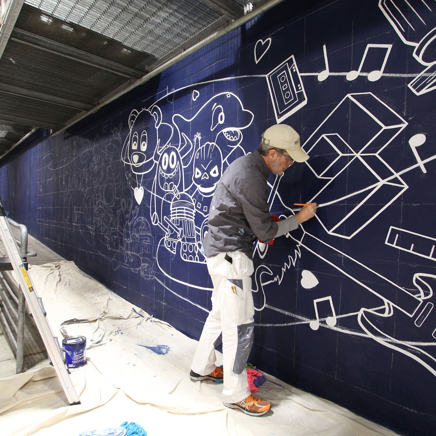
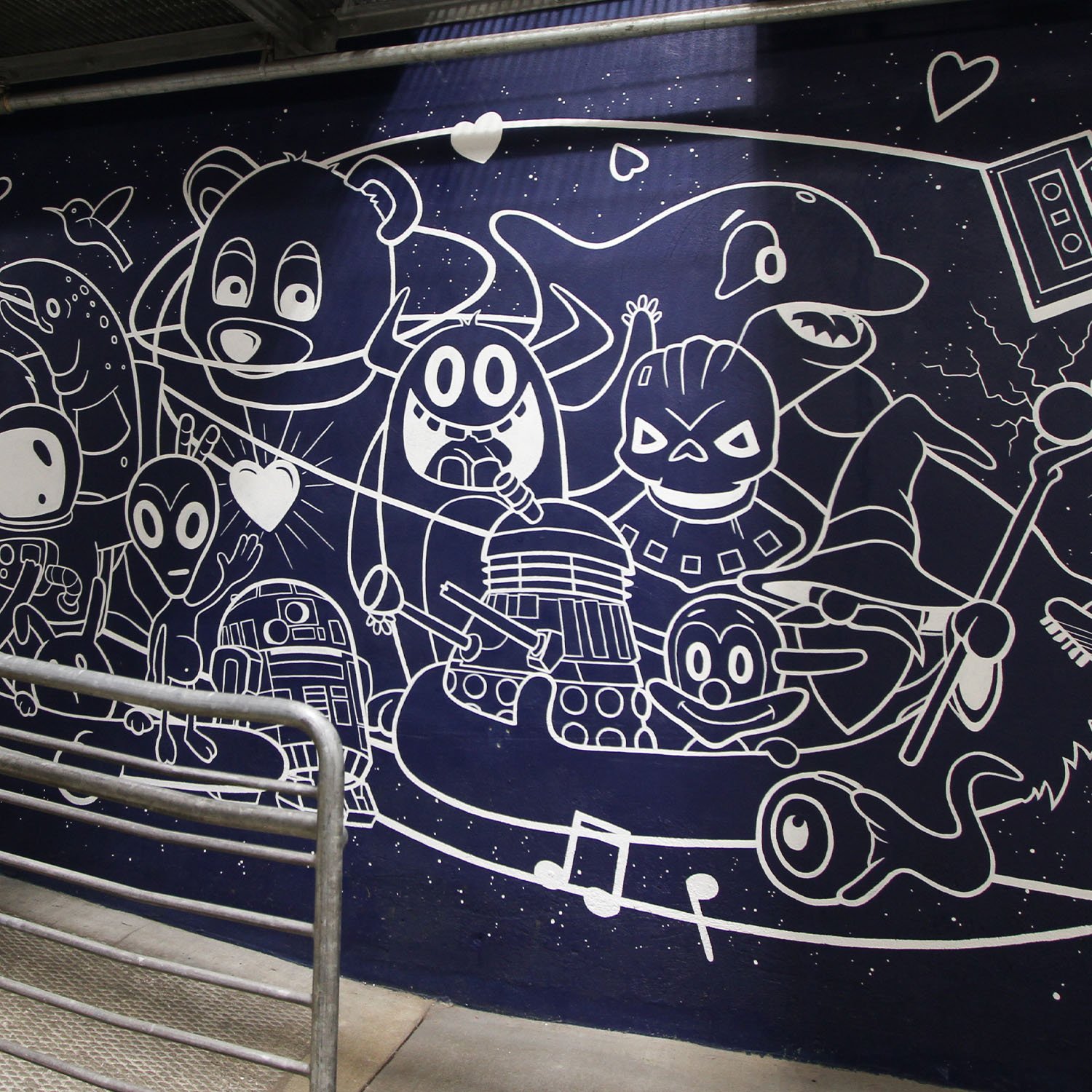
In this section we find the “College Dropout Bear” from Kanye West whose arms are encircling a mashup of characters from museum exhibits, Pacific Northwest creatures (you may recognize) and mythology, and a few random characters representing the amazing family of employees, volunteers, and patrons who give life to the museum.
Why would you include Kanye West, he’s politically toxic!? Regardless what you think about him personally, his contribution to music cannot be denied, plus this image can be found in the museum’s hiphop exhibit. Simply put: The College Dropout Bear is a character he created that symbolizes the one idea every single artist on planet earth can intimately relate to: Pursuing your dreams [in spite of endless obstacles]. Kanye will be Ye, but he’s a thousand percent correct in this … Pursuing your dreams is the ultimate risk and reward (“success” is a very subjective concept). Ultimately, this is what MoPop is all about, sharing inspiring stories of artists who pursued their dreams with young minds dreaming of possibilities and this is why I chose the College Dropout Bear to represent the team that helps the museum achieve this goal.
Value 3 — Creative Exchanges
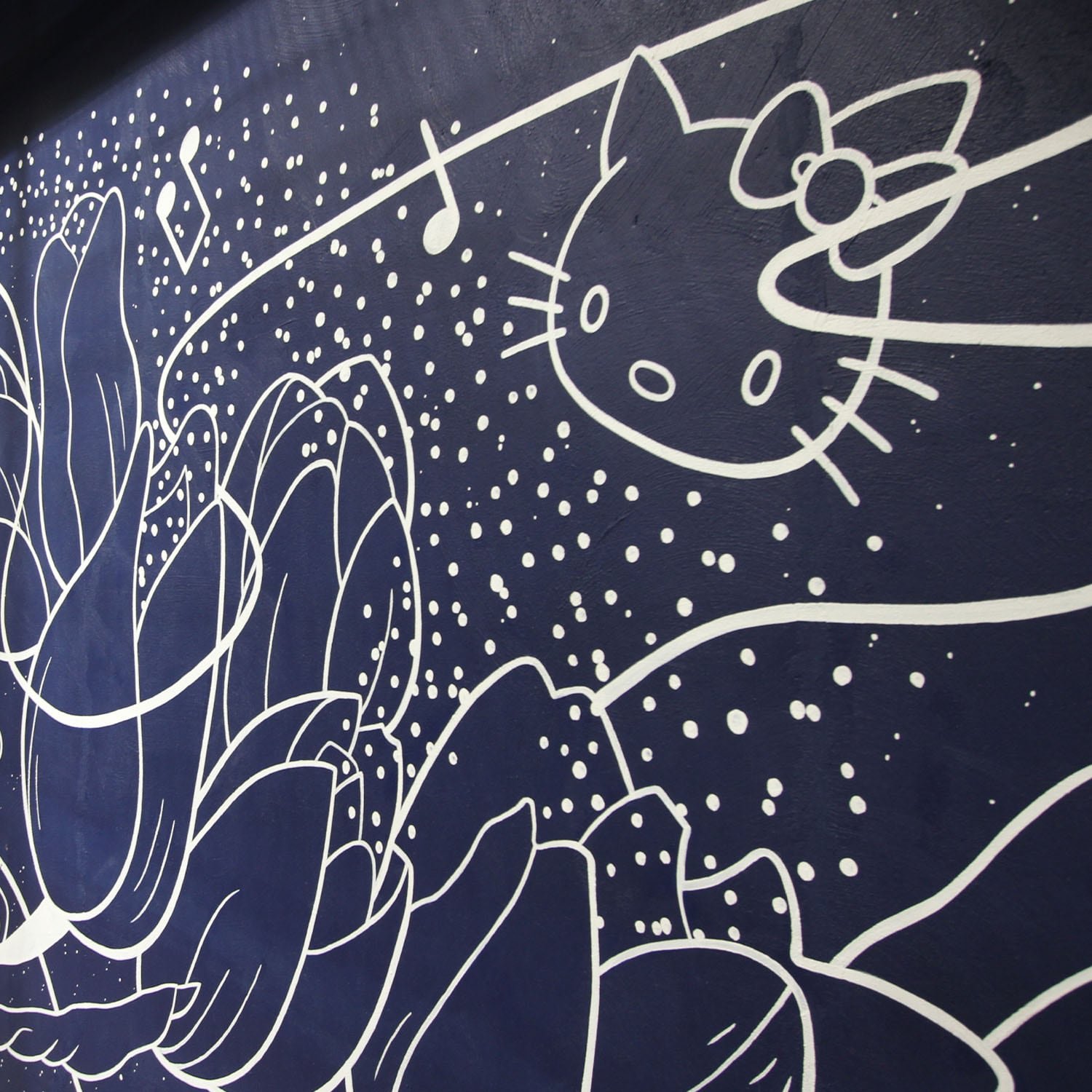
The local community is portrayed in this scene by the landscape of the Pacific Northwest, highlighted by silhouettes of Mount Rainier and the Seattle skyline, a nod to the Kraken, and includes a couple hints to past and current exhibits including Hello Kitty (my all-time personal favorite) and Nirvana’s groundbreaking album “Nevermind”. A group of Tulips, referencing Washington’s annual tulip festival, are shown with pixie dust or pollen emanating from the flowers further suggesting the local community and the act of collaboration seeding the ideas that makes MoPop possible.
Value 4 — Connection/Light Bulb Moments
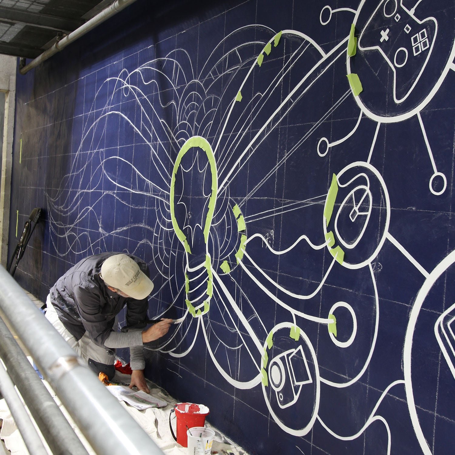
The centerpiece of this section is a light bulb that “illuminates” elements of the museum linking the ideas of creativity, invention, and connection with the final value, excitement. This section represents the museum’s ultimate purpose: Inspiring the desire to learn and create. The design of the pattern surrounding the light bulb is pulled directly from a stained glass window painting found in the horror exhibit.
Value 5 — Excitement
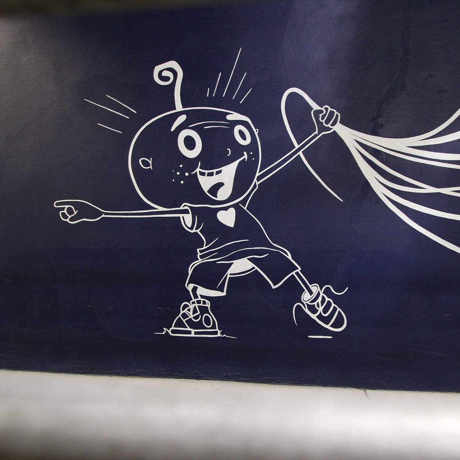
The final section culminates with all five musical staff lines combining in a flurry of activity representing the team effort, dedication, and love that goes into creating an exciting experience at the museum for guests. The little alien creature is a playful reference to Sci-Fi who is enthusiastically inviting friends and family to enter the fun, innovative, and creative world at the Museum of POP Culture that he’s pulling with him like a balloon. The alien is pointing into the museum directly at the mission statement.
I tied everything together with a clever visual device that recalls the origins of the EMP museum: Musical staff lines. Standard sheet music is comprised of five staff lines; each staff line in the mural represents one value and all elements in the mural flow along these lines. Furthermore, each staff line terminates at one of the five value sections. The lines help connect a visual feast of objects but also adds dynamic movement for the viewer’s eye to follow along the full seventy-seven foot length of the mural whether he/she is viewing the mural from a distance or walking along right next to it.
Concept sketch showing value sections with keywords extracted from value statements for reference.
Presentation
I presented the initial sketch to a few stakeholders as a white line drawing on the blue wall just to introduce the concept before applying color (I didn’t want anyone to be distracted by color). After walking them through my thought process, I suggested they consider a white line drawing as the finished mural for a couple reasons: 1) I didn’t want to fight the blue and 2) a white line mural would look striking and be very unique.
Their initial reaction was very positive, but I had to wait a few weeks for final approval as the concept sketch made rounds through the upper echelon of the organization.
MoPop approved the concept art with no changes and decided that they really liked the idea of white line on blue. I was given approval with an enthusiastic thumbs up.
MoPop values mural concept sketch superimposed on wall composite photograph.
More Preparation
After the concept sketch was approved, I purchased a few supplies then returned to the museum to measure the wall. I knew I would have to adjust the drawing because the mockup I created didn’t take into account for a 12 inch jog in the elevated storage.
I brought a laser level and a couple long straight edges to help the process and I set about measuring the wall from a vertical baseline at the end of the mural and worked my way back to the starting point. I established a top line that extended the full length of the wall and measured down to create a bottom line that also extended the full length of the wall. This uninterrupted rectangular “container” space measured a little over 6 ft in height. The mural varied up to 2 ft above or below these horizontals and then up to 9 ft at the head of the mural. After taking detailed measurements accounting for the incline, railing attachments, conduits, and electrical outlets, I marked off an area that measured 77 ft in length with a total area of 544 sq ft. The final grid would be a straight one-to-one ratio. It turned out that the original mockup was nearly dead-on and I had to do very little to tweak the artwork to fit the space.
I also ran my hand down the length of the wall to gauge the texture. I found that the “stucco” was much heavier along the margins than down the center of the wall with an occasional patch of light texture for 90% of the surface area. The texture changed dramatically nearer the entrance where slab concrete was used to construct the wall—There was about ten horizontal feet of light stucco punctuated with patches of beautiful flat surfaces. Why was this important? It helps determine the type of brush to use.
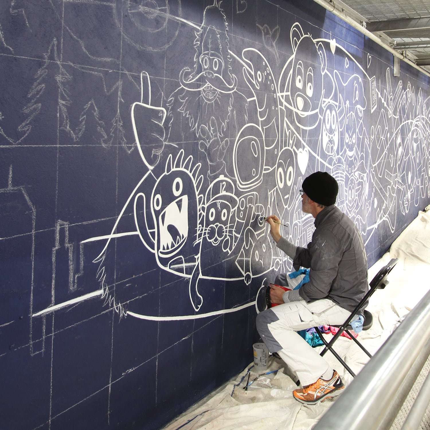
I was good to go. The first brush mark was laid down on November 7.
Materials
My materials list included: brushes, painting pants with knee pads, chalk, tape, a paint bucket with removable liners, straight edges, buckets for water, lots of rags for clean up, drop cloths, small step ladder, can key, stir sticks, hammer, and scaffolding. I also had access to the museum’s tools, including a power drill and paint mixing extension that fit into the drill chuck.
I brought my personal collection of beater brushes and purchased about ten different brushes in the hope of finding the right combination for the project. It took me roughly half the project to finally find the perfect brush combination and paint consistency to deal with light to cursing texture. In the end, twelve brushes met their fates, but the best performers survived until the last brush stroke due to diligent nightly care.
I wound up using two gallons of white exterior acrylic paint and a half gallon of the blue base paint.
THe Grid Method
1 foot to 1 inch grid ratio.
There are a number of ways to transfer an image to a large surface, but there was only one that made sense for this mural: a standard grid. Why not a doodle grid? Simple, there was no way to take a full lengthwise photo to overlay a doodle grid. Freehanding this artwork wasn’t an option either due to the detail in my artwork and the length of the mural.
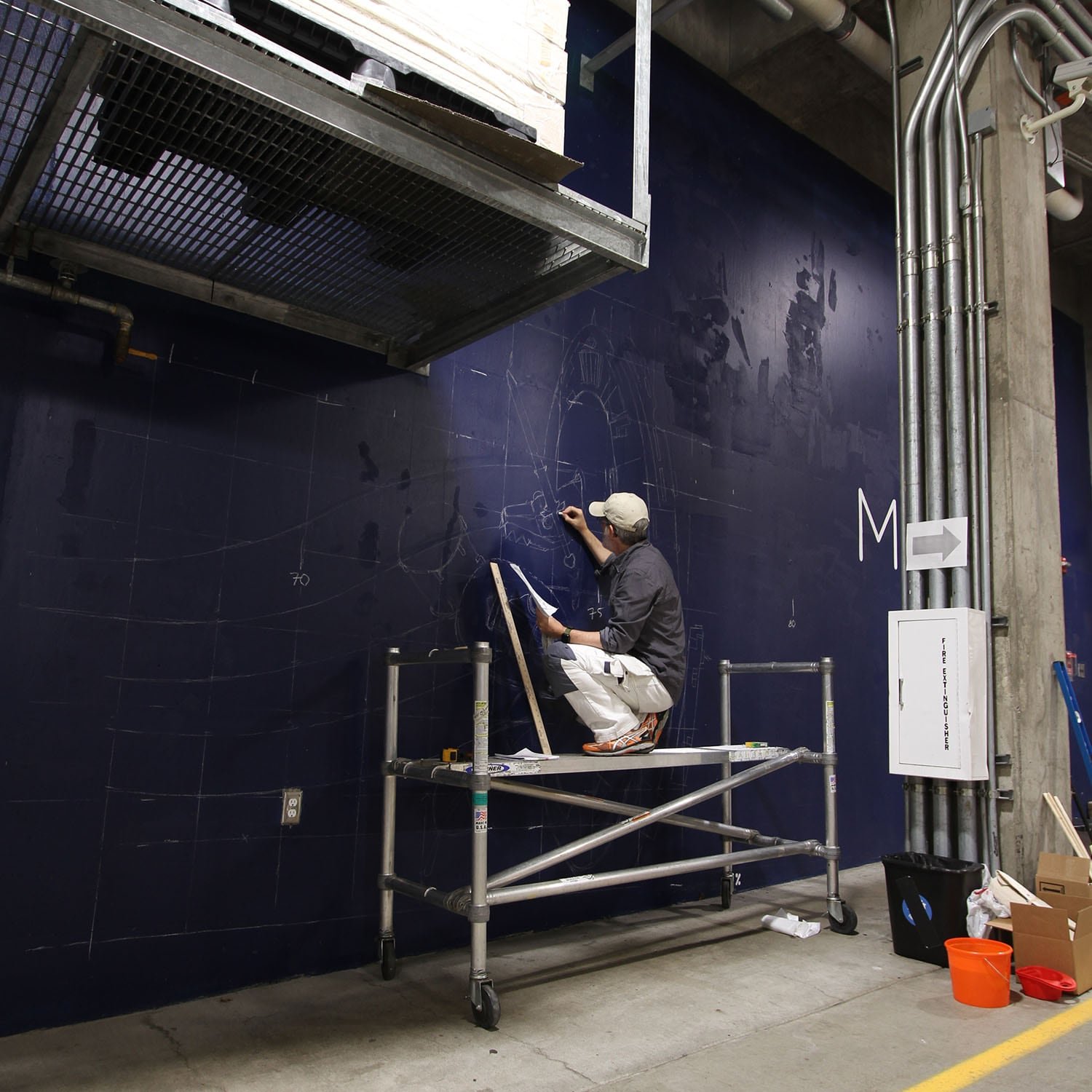
I quintuple checked my measurements, triple checked my blueprint, took a deep breath, and started to map out the grid.
Ironically, I drew the space gate on the wall and immediately realized I was a foot off—Washed off the chalk and shifted everything twelve inches to the right and started over (Good to get that mistake out of the way on day one.)
Tip: Step back frequently and view your work from a distance to spot errors.
Process
I created a master grid in Illustrator using my measurements and notes, then pulled the grid into Photoshop to overlay it on the artwork and composite photograph. I created three views for my reference and had this master grid(s) doc printed on 18x24 paper to use as a blueprint. I also loaded the master file onto my phone as a backup image and loupe. Finally, I separated all the objects, enlarged each individual drawing, and created an 8.5 x 11 booklet of image resources to aid painting details.
Working section by section, I transferred the image to the wall by hand using classroom chalk while referencing the grid to plot all the art elements. The sketching usually went fairly quickly and I was able to make adjustments and numerous improvements to the art along the way. Overall, the final artwork is 99% accurate to the concept sketch and no one but me will ever know what I changed;)
The entire mural was hand painted.
Why didn’t I use spray paint?
For starters, I’m far more comfortable with a paintbrush, but because this entire image was a line drawing, spray cans simply couldn’t achieve the hard edge necessary to pull off the artwork. Personally, I’m just not a fan of fuzzy edges. Yes, I could have probably finished the art in half the time if I’d sprayed it and, yes, it would have really helped with the heavy texture, but it wouldn't have been anywhere near as precise and the detail would have still needed to be painted by hand—the difference between the two techniques would have stuck out like a sore thumb.
Finding the right brushes was a challenge. Most of the wall was a medium to very rough stucco texture which made painting a clean edge a very slow, laborious process—If you stood next to the mural and looked closely at the edges, you’d see that it’s not a perfectly straight line. Heavily textured surfaces make fine detail a challenge and there was a ton of fine detail in my art. Softer, fine detail brushes worked well with perfectly thinned paint—Too thick and the paint wouldn’t glide over the stubble and too thin it would drip. This was a balancing act for the entire project. I found that pure synthetic brushes with tight heads performed the best on rough surfaces and while they don’t hold anywhere near as much paint as higher end bristle or natural hair brushes, they had the perfect amount of stiffness for long strokes. The two brushes that saved my sanity were from a “street” series made by Liquitex.
How did I create the large circles in the “connections” section?
I had planned to create a DIY compass using a long straight edge and a drill, but I wound up using tape, a length of string, and chalk instead. Worked like a charm, mostly.
Implementation
The wall was located in a high traffic area and I chose to work the night shift to avoid constant interruption and the potential for accidents. I was given a remote control to access to the garage and arrived at the museum after regular business hours around 7pm each evening and worked until 4am to 5am the following morning—I was told the security staff logged me in each day as “Paul the Muralist”. Each shift, I would spread out drop cloths, re mix paint, prep water pails, plug in the boom box, and arrange everything to minimize the tripping hazards I was creating along the walking path. The only downside was that the temperature would drop precipitously every night around midnight when the late night maintenance crew would open the giant garage door to put out the garbage dumpsters.


I initially estimated two to four solid weeks to complete the mural. Twenty-two days (over six weeks) and two hundred two hours later, I finished the mural on December 20th.
Conclusion
This was a special project and I’m honored to have contributed my art and vision to one of my favorite places in Seattle and I hope it provides MoPop employees with joy and inspiration for many years to come. This mural is my first museum piece and, with any luck, it won’t be my last.
Thank you
James Vegas, Michael Cole, and Jennifer Chu for giving me this opportunity, and every member of the security staff and maintenance staff for your patience and care.
I especially appreciated the support and compliments I received from everyone who commented on my work while I was painting. Visual artists don’t typically get a lot of love and it’s humbling to hear.
Thank you, all.


Fun Fact: 202 hours without a single consequential mishap—no major paint spills and no injuries due to tripping over drop cloths. That’s a success.


