
A couple months ago, I was out in the neighborhood late one evening and decided to swing by a local bar for a drink. From the street, I heard a band playing something funky that instantly had my ear, in no small part because the two musicians were a seemingly mismatched duo if there ever was one: an MC and a harpist. They were half way through their set but I loved their sound so much that I made a point to see them perform at another club a couple nights later. After an introduction and a brief conversation with them before their show that night, I passed along my contact information on the off chance they were looking for an artist to help them design the album art for the upcoming release of their second album.
Two days later, I got an email. They wanted to work with me.
Concept sketch was approved with minor changes
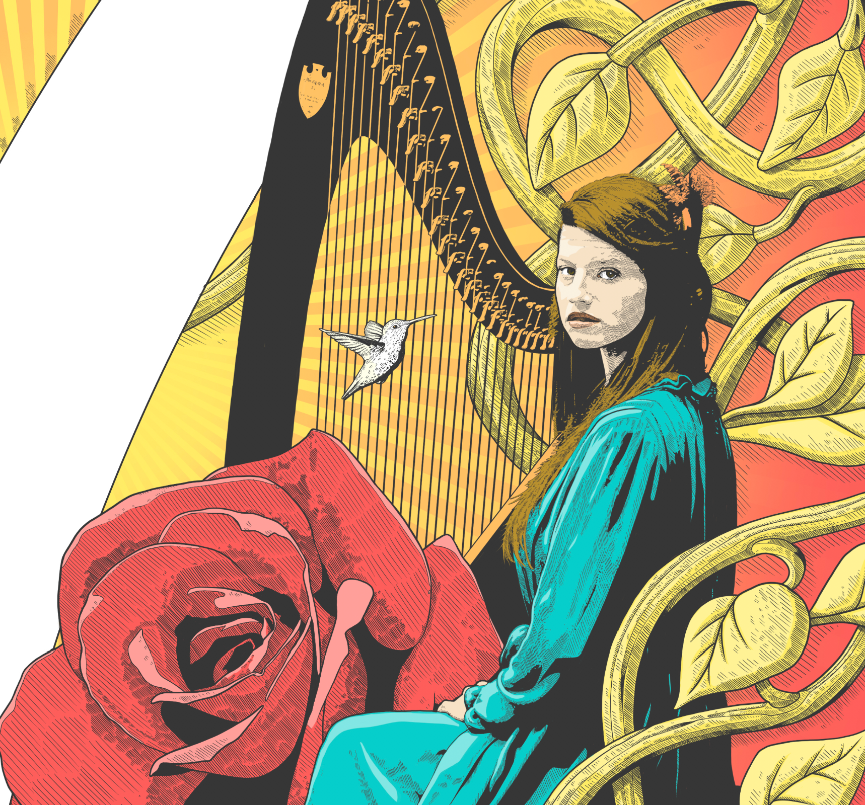
The album title “7” represented seven ideals: Love, Strength, Freedom, Pain, Light, Roots, and Energy. Their art direction was to pattern the image after a specific image in my portfolio and create a “collage” of various objects that were important to them.
To expand that idea further, I suggested representing the seven ideals with objects and then tie it all together with some artistic wizardry. I felt it important to include images of the artists themselves to help emphasize the uniqueness of their collaboration (which is something their first album cover did not do.)
After doing some research to learn what if any objects represented the seven ideals, I came up with a list of objects to incorporate into the illustration …
Love = heart, roses
Strength = lotus flower
Freedom = feathers, bird
Pain = skull
Light = sun rays/burst of light or light bulb
Roots = tree of life (winding throughout and integrating everything)
(positive) Energy = flowers, musical notes
… and a novel way to integrate everything into a finished piece of art that resembled a crest of sorts—the resulting illustration is a finished piece of art that can easily be repurposed for virtually any media (album cover, t-shirts, tour posters, postcards, you name it). It just works.
I also wanted the final illustration to be able stand on its own as a black and white image to give it even more flexibility.
The final color version utilizes a limited color palette to help tie it all together.
The entire piece took 79 hours to complete and was drawn on a Wacom Cintiq and an iPad Pro using styluses.
Note in the detail images below that the hatching flows in one direction: diagonally. Each individual line and stroke was meticulously drawn by hand.

In the end, despite getting the concept sketch approved, the final piece was rejected by the band and my art will not grace their album cover.
Nonetheless, I’m quite proud of my work.