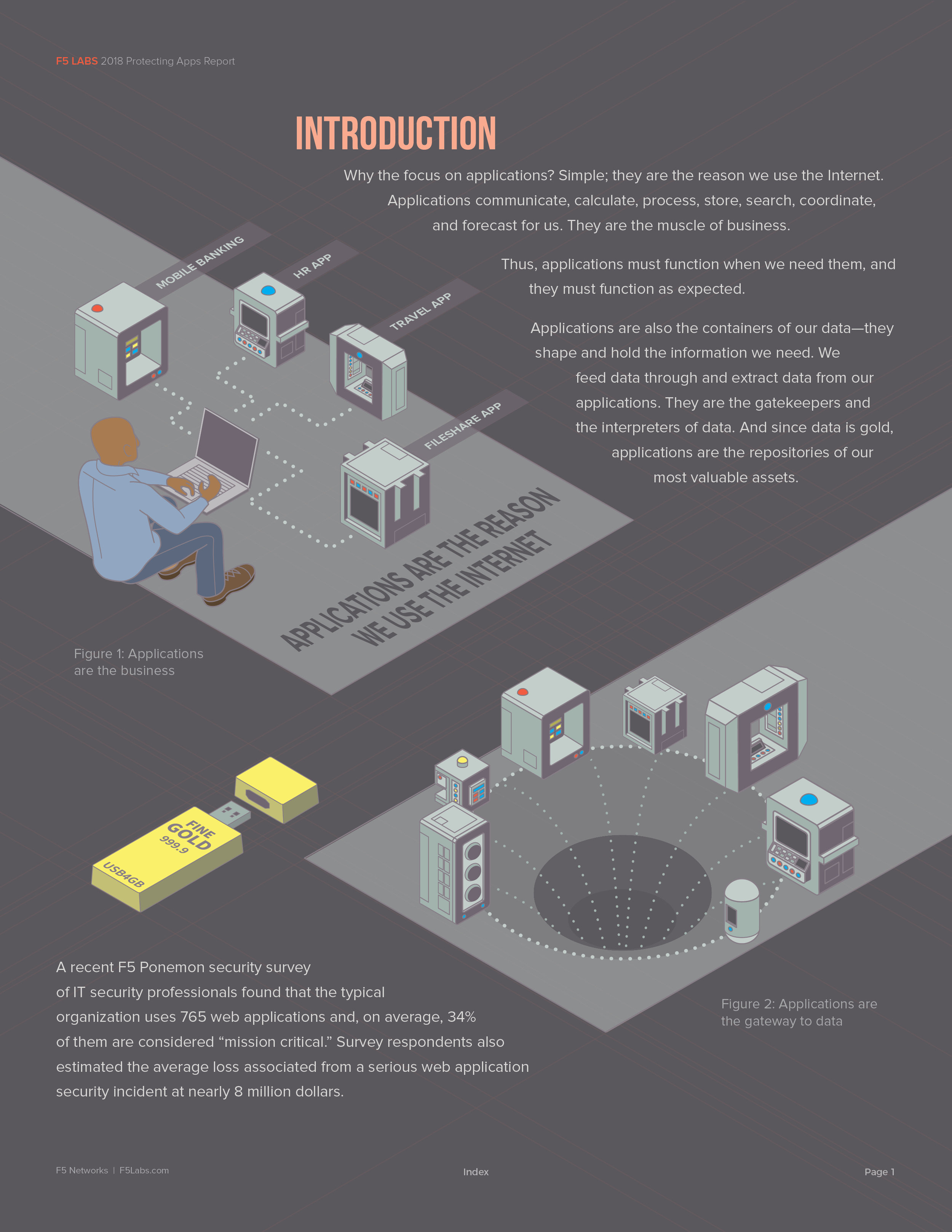
The Project
I was tasked with "updating" the following graphic. This graphic is the foundational concept behind my client's entire business. In other words, it's been used to sell their services for years.
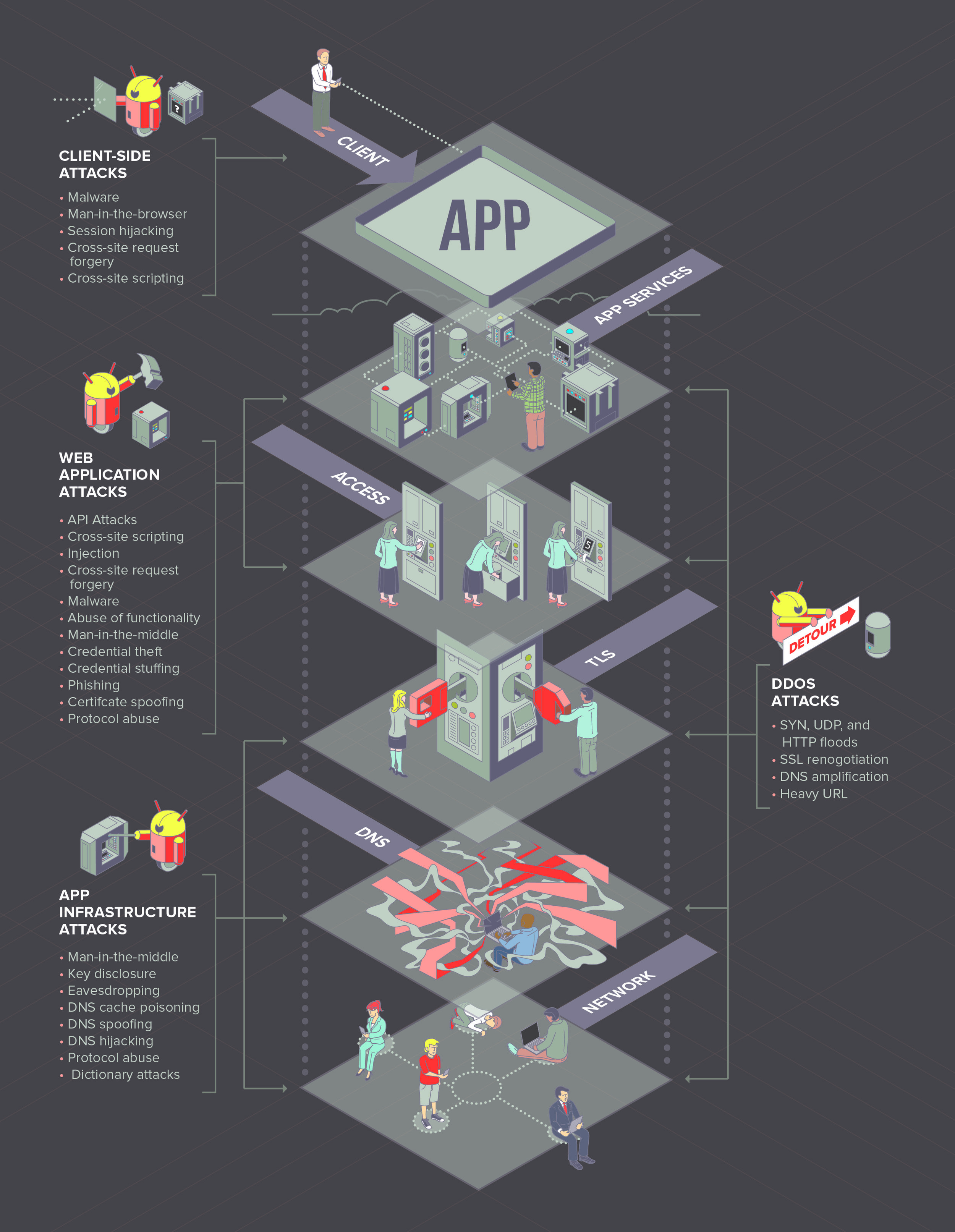
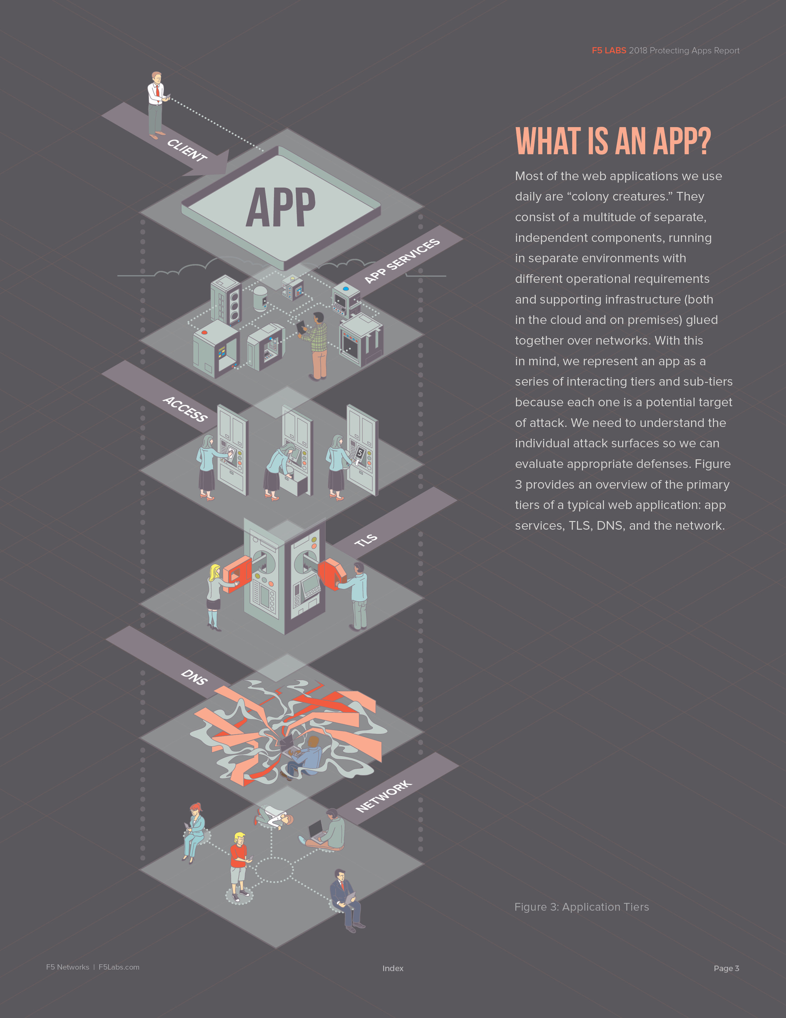
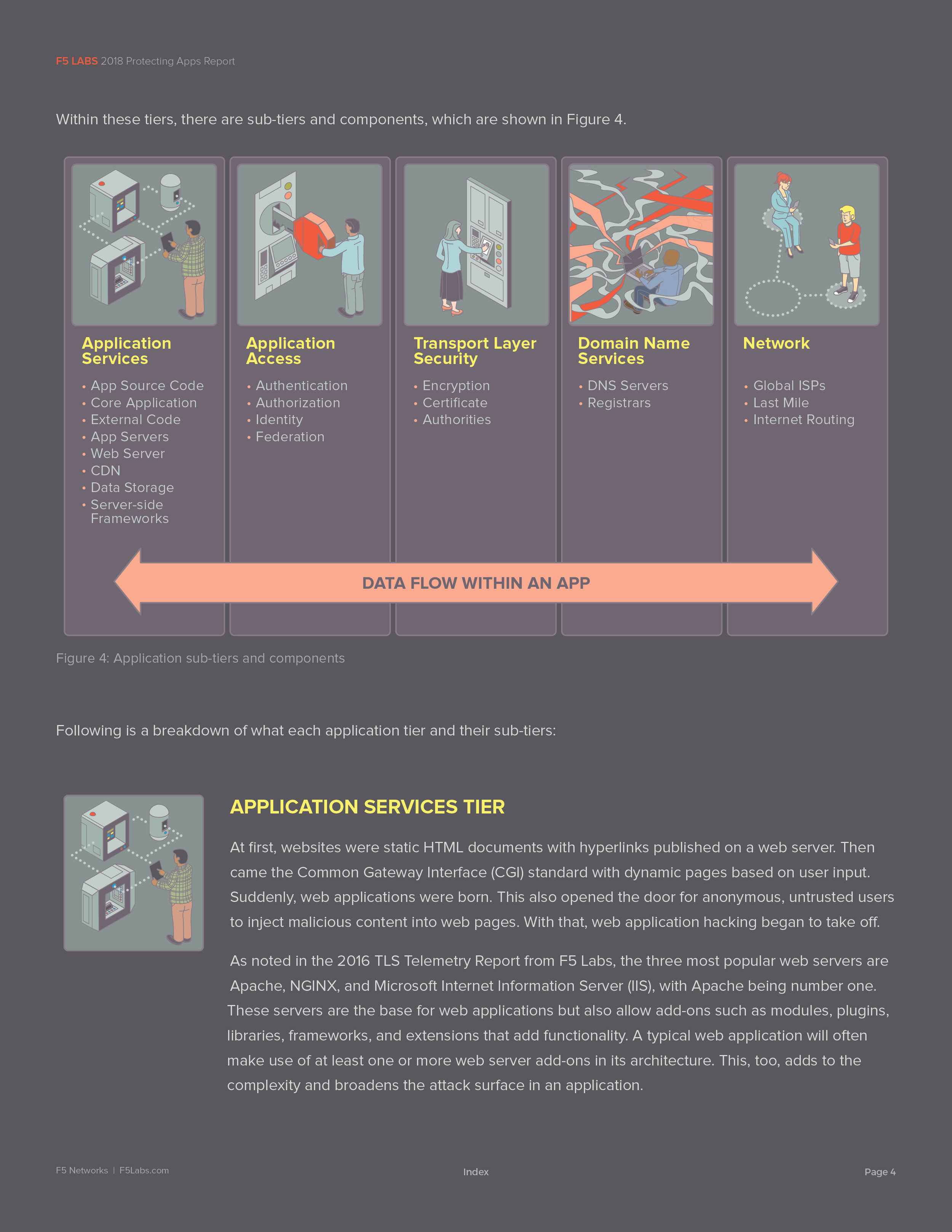
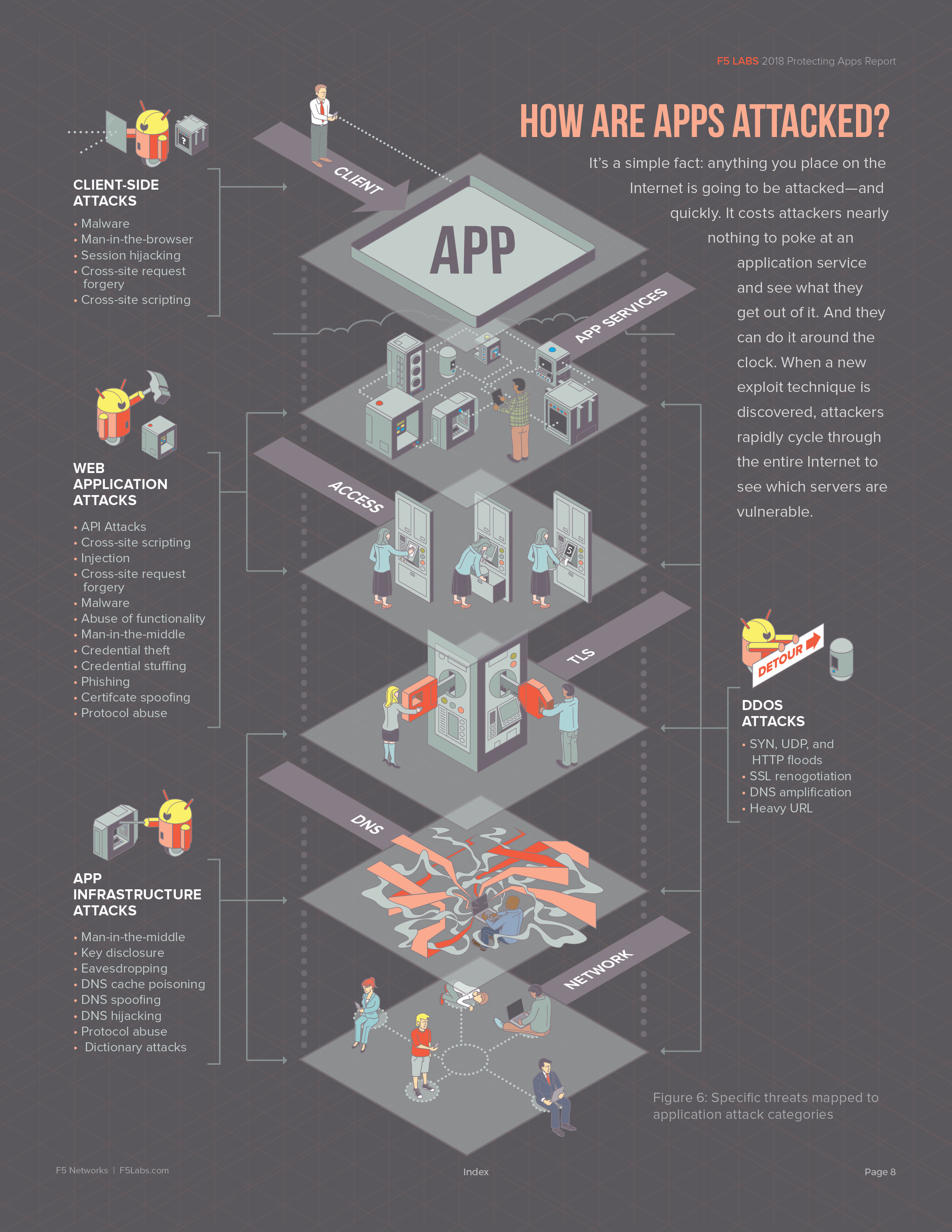
Application Security Tiers
At first glance, there seems to be a lot of information being presented. What you don't see is any real clue describing what's happening. Without the assistance of paragraphs of text or a salesperson, the viewer is left to their own devices to derive any meaning.
The application "stack" is represented by icons that tell the viewer very little. And the accompanying text identifiers are equally amorphous.
You'll also note a variety of graphic elements that are meant to clue the viewer in to a larger idea, but all of these elements largely fail to create a cohesive visual narrative for anyone trying to decipher the graphic.
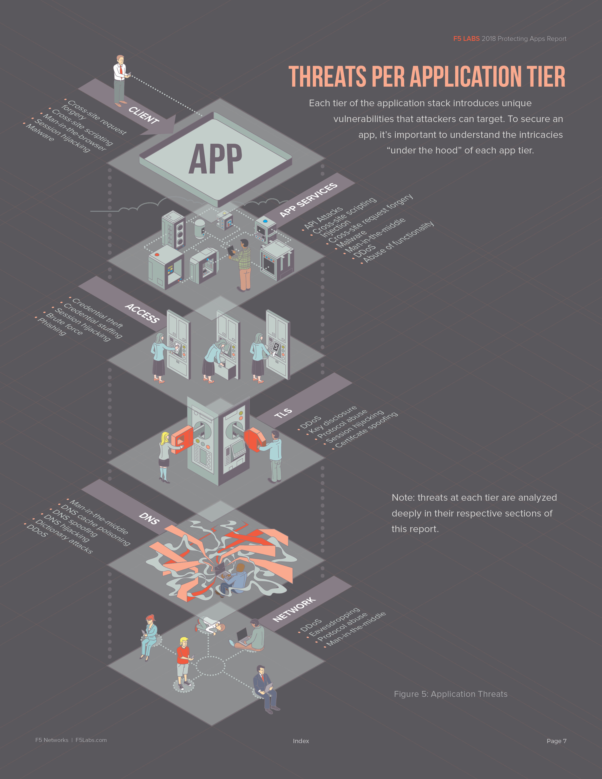
My Solution
The solution I arrived at solves these issues — I created visual metaphors that accurately depict what literally happens at each tier. The simplicity of the imagery and design affords a viewer with no prior knowledge of the basic concepts a means of "creating" a narrative for themselves without the help of accompanying text.
The "isometric" grid underlying this illustration helps create a plane for the tiers. I added flags at each level to help draw the users eye through the entire illustration. Once the basic art was created, I made a few slight adjustments to accommodate the text for the next two graphics.

Application Security Tiers Revisited
After
Before


In layout
Overall, this is a highly successful piece. That it was a casualty of "committee" is just a consequence of opinion. It happens.
Stay tuned for the next version.