
Regardless of which tools you use, working digitally allows you a great deal of flexibility if you’re organized. I’ve described in a previous article that the limitations of the iPad are a legitimate consideration, but I’ve yet to find a better and more portable digital drawing experience.
I digress …
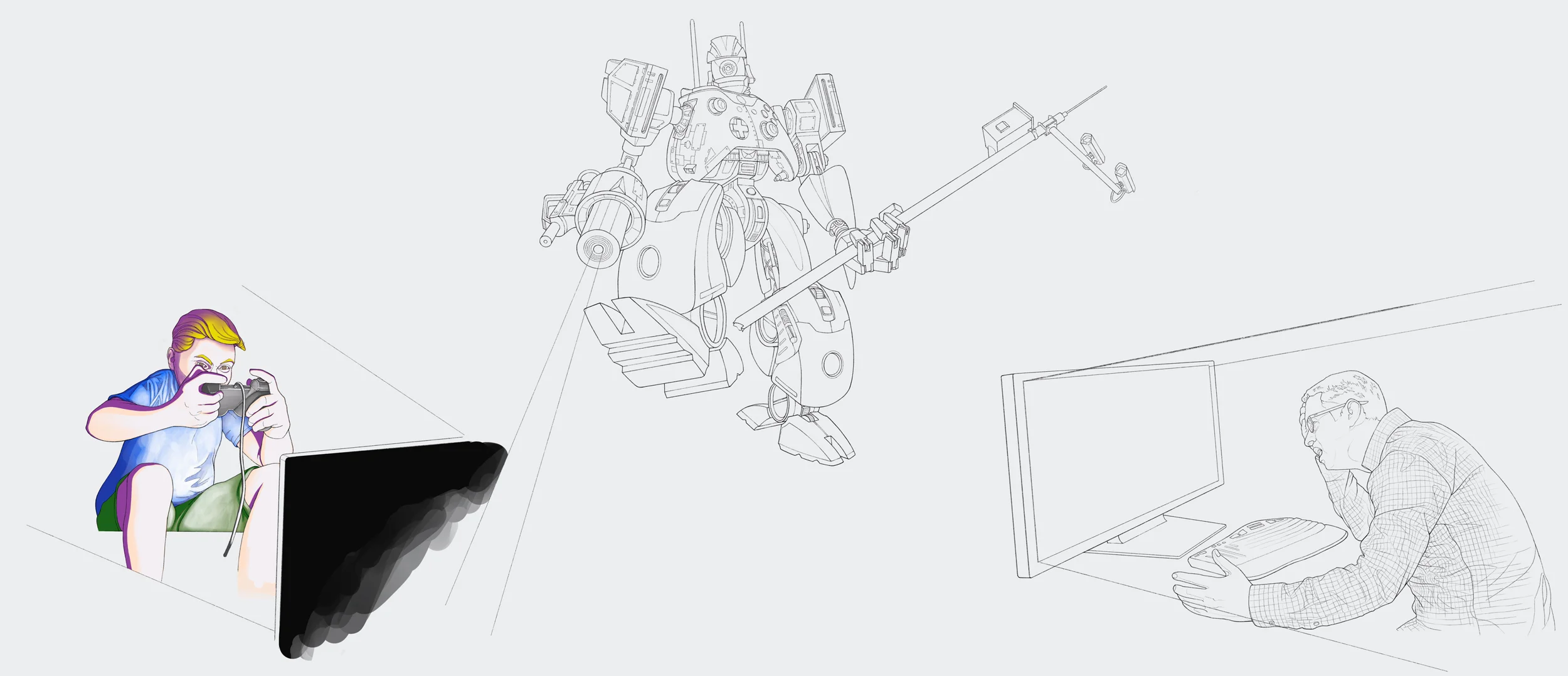
I began this project by creating a blank canvas in Procreate that measured 25.5 inches x 11 inches and sectioned into thirds measuring 8.5 inches. Then I started sketching with my stylus, hacking out a robot, and adding game console elements to get the basic idea on paper.
I think it’s safe to say that you will have some semblance of a layout rattling around in your head prior to picking up a pencil. Even if that vision is hazy, developing the main characters first will aid you in nailing down the layout. Sometimes the brain-to-paper translation isn’t as clear as you’d like.
This illustration would have three primary characters: the attacker, a new Thingbot, and a victim. I sketched the victim, then began hashing out the robot. The sequence below provides a window into this process. If you look closely, you will see that I made numerous changes to the robot during this sequence.


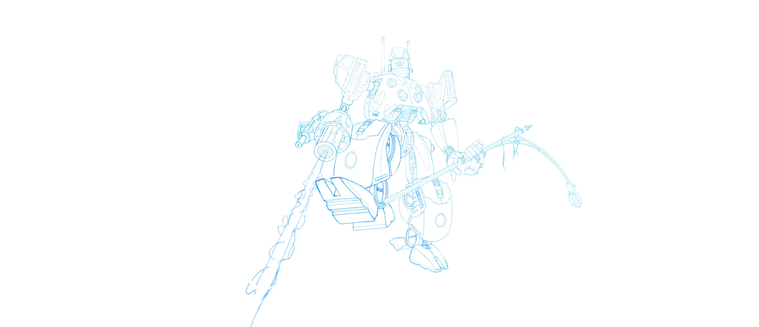

After loosely scribbling their basic forms, I sketched the final roughs of the primary characters with a blue line (same method I use with my analog sketching). Then I started to work through the secondary and tertiary elements as shown in the next set of sketches. Each of the characters and elements were drawn individually and placed on separate layers so I could easily move them around and make adjustments to the layout as needed.
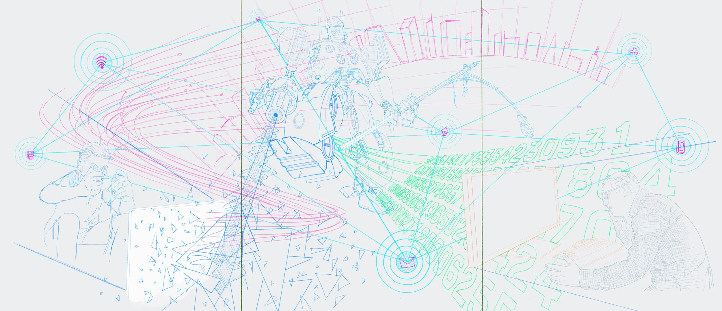
Concept sketch showing proposed placement of headlines and logos per panel
When I was satisfied with the basic composition, I submitted the concept sketch to my client to get approval and feedback. I was asked to make a few changes to the artwork to help clarify the concept. Rather than updating the concept sketch and submitting a second comp, I decided to make the revisions while I was drawing the final line art. Sometimes resubmitting a concept sketch is necessary (e.g. if you are unsure about the direction), but I try to avoid unnecessary approval stages—Give any client too many chances for input and you will never meet your deadlines.
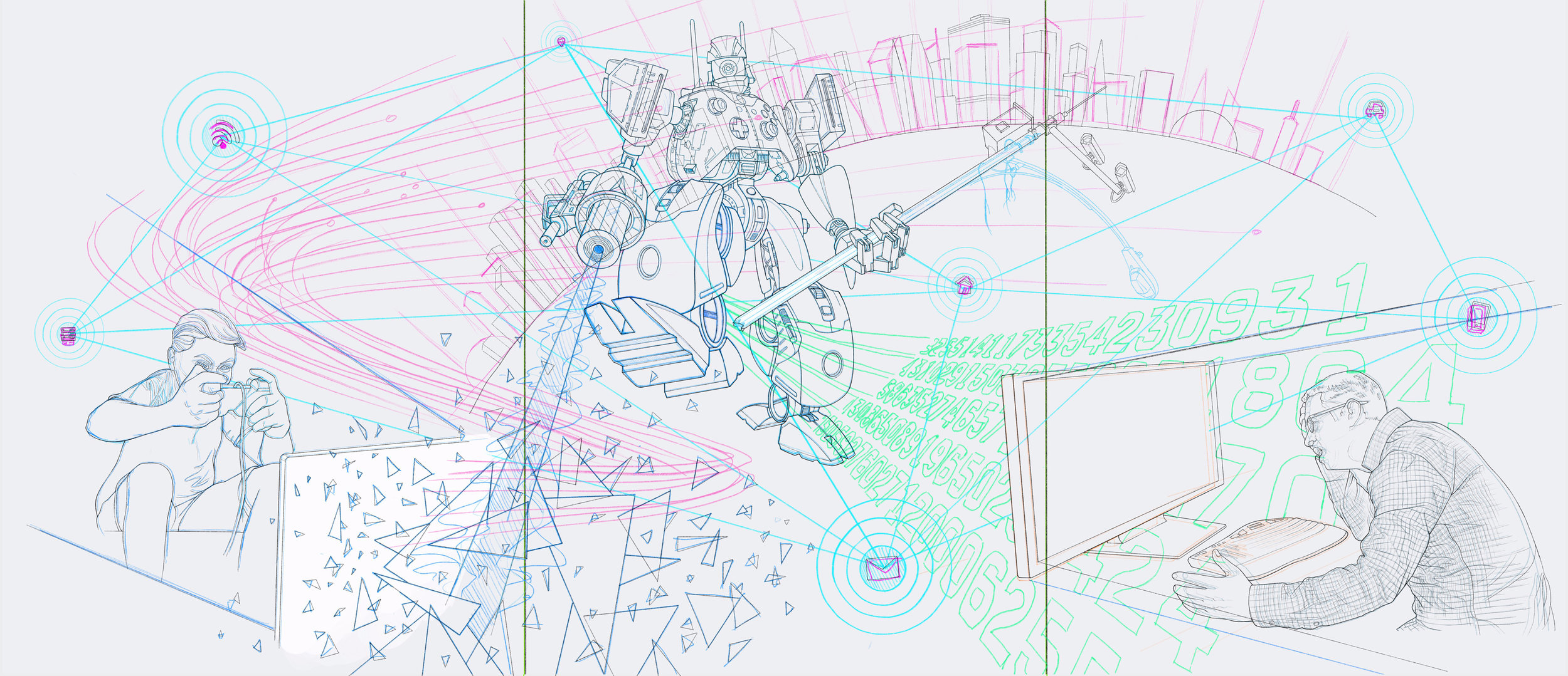
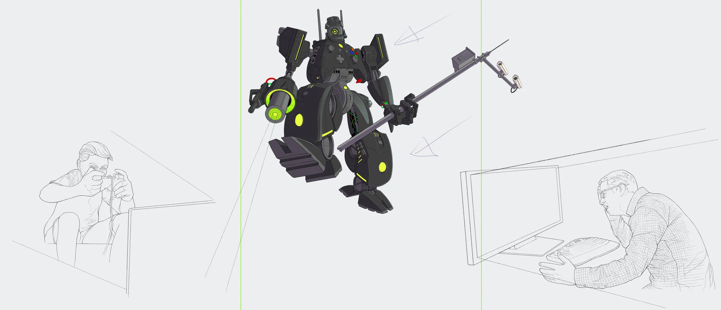
Cleaned up the line of the robot
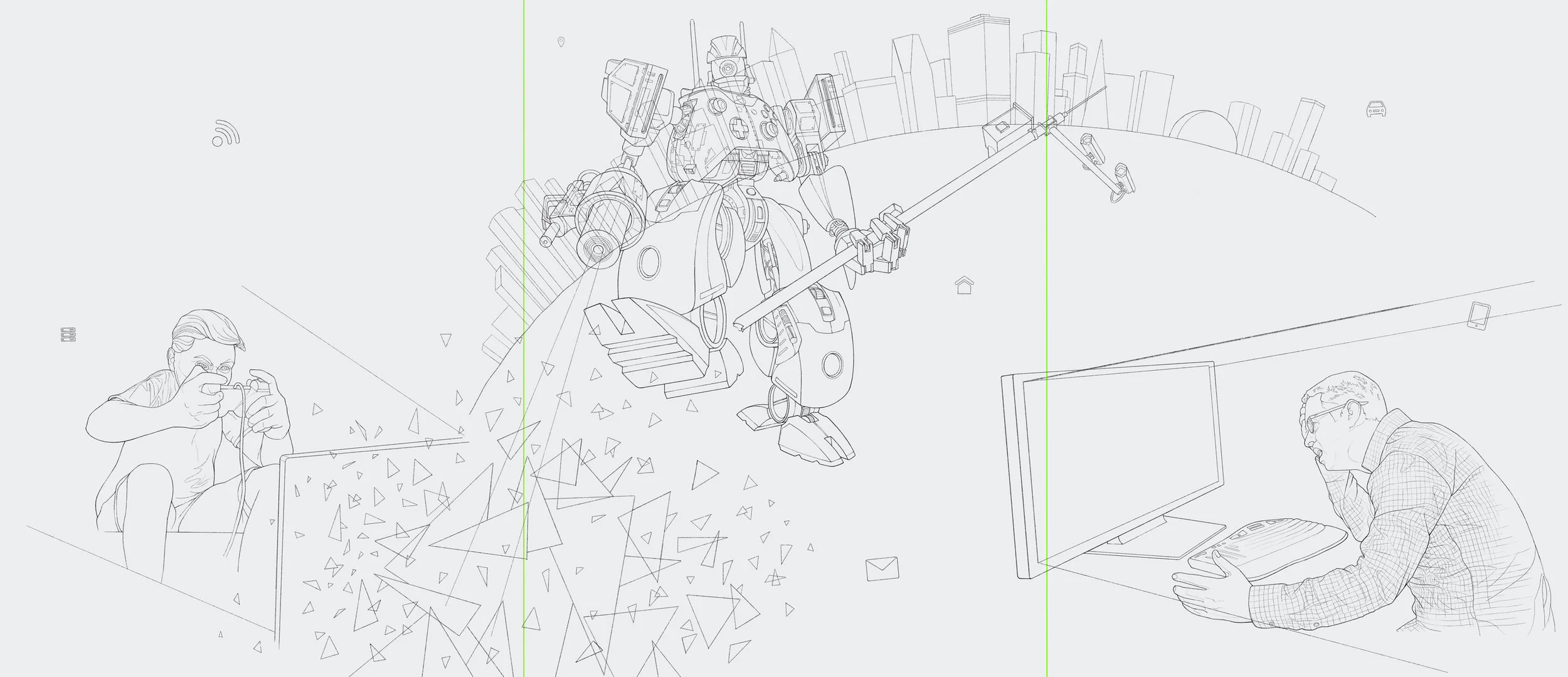
Concept approved, the next step was to redraw all the objects in the illustration with a sharper pencil tool and black line.
Can you spot what changed in the illustration below?
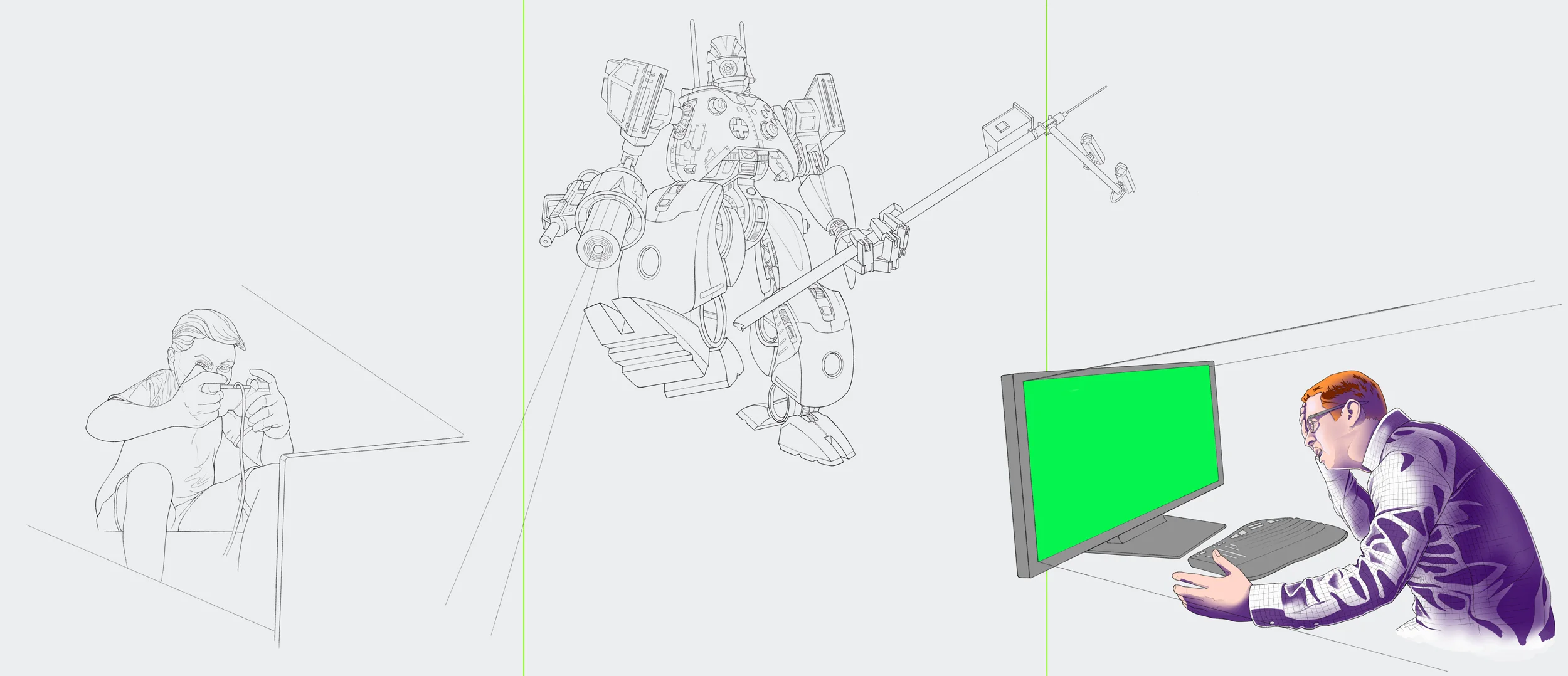
The coloring process is similar, just with many more layers. Working in Procreate on iPad requires planning because of the devices’ inherent limitations. Namely, the aforementioned layers. Procreate simply doesn’t allow enough layers to organize a complex illustration like this. Coloring required duping the base line art file and creating a separate file for each object. The final illustration was pieced together in Adobe Photoshop on my MacBook Pro from a dozen or more exported Procreate files.
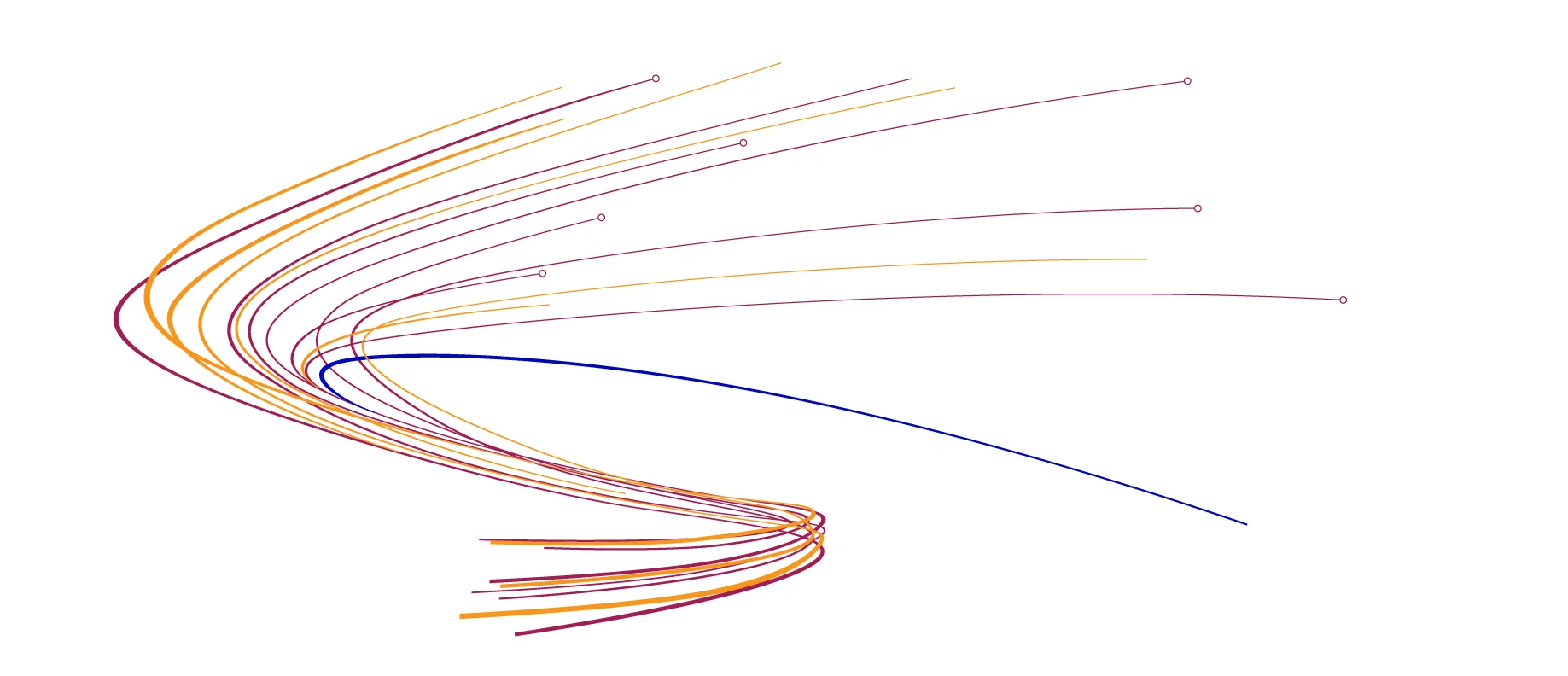
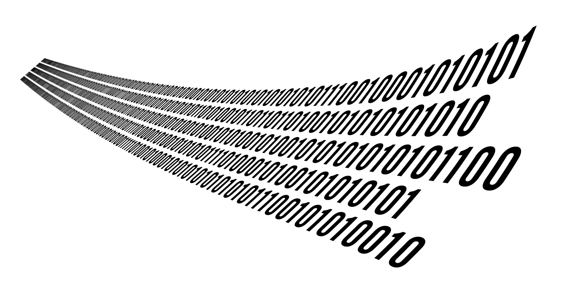
Design elements, like the wavy lines and binary code, were created in Adobe Illustrator using an exported JPG of the layout as a guide, then copied and pasted into the master Photoshop document. Again, process—this is where knowing your craft inside and out helps you figure out how best to produce individual elements within your illustration that may or may not work as effectively if drawn by hand.
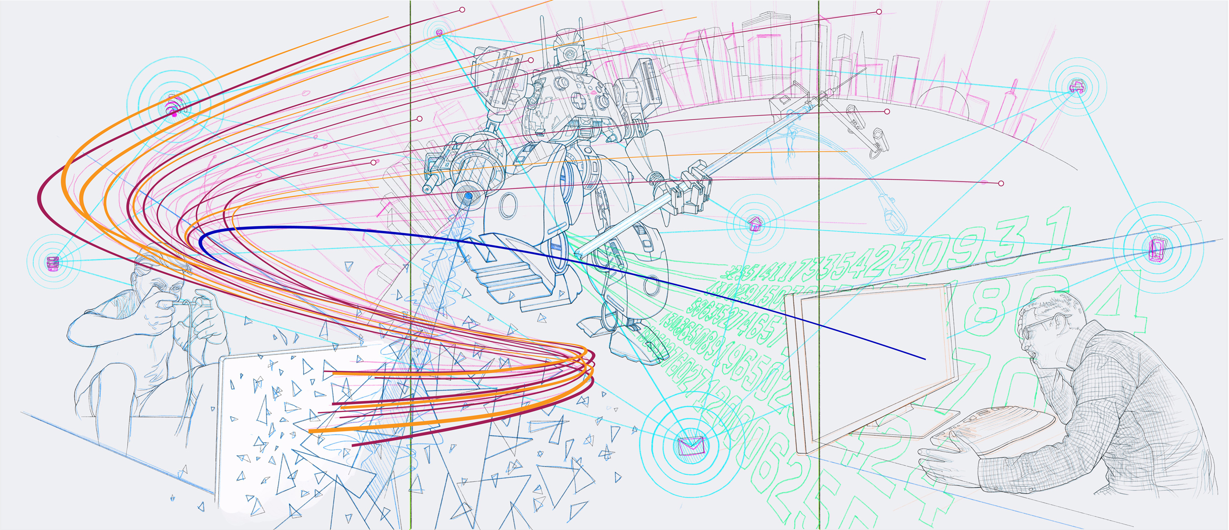


I added the bits and pieces of the illustration to the master Photoshop file as I completed them.
When the primary objects were all in place, I began tying it all together with design elements, visual effects, modeling, and magic.
At this stage, it’s all about tweaks. Assuming you’ve done a good job of organizing and managing your project, it’s possible to make big changes as painless as possible … because changes can happen at any stage in a project.
The image above looks almost finished, but there is always room for improvement. Comparing it with the final image below reveals a host of minor changes that make a big difference in the overall cohesiveness of the story.
Final illustration
Last change: While the final illustration (shown above) makes perfect visual sense, alternating the panel colors adds yet one more visual clue for the viewer that this illustration represents a typical web “attack” process. A simple color change isn’t always so simple—Good file organization allowed me to painlessly make dozens of minute adjustments on each panel to accommodate the background greens.
Final illustration with variation of panel colors